 Flower Love

In terms of interior decoration, colors are not selected by default. Working with colors seems easy at first glance, something like choosing your favorite color for your favorite room.
However, this is very far from the truth! Good results from random decisions are pure luck, but knowing nothing about colors and combinations is unlikely to make any of us happy, especially if we are aiming for a professional look.
The first thing we should know about colors is that they are divided into warm and cold, and that designing with warm and cool colors is something completely different. Are you ready to discover the core of using warm and cool colors in your interior? Let’s start!
Warm colors & cool colors
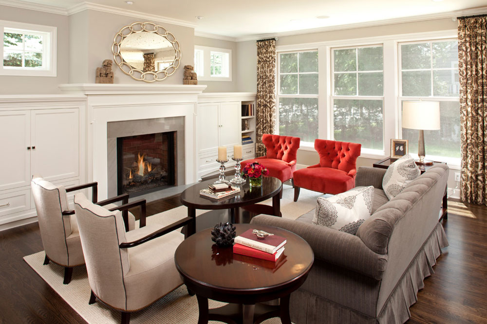 Image source: REFINED LLC
This is the basic, pretty self-explanatory, division of the colors on the color wheel. Warm colors are orange, red, yellow, cream and beige. while blue, green and gray are cool.
They are clearly opposite each other in the color wheel, which at the same time shows us the results we would get by mixing. Even green can be a hybrid, provided you got it by combining blue and yellow.
The hybrid can be warm or cold, depending on the dominant amount of warm / cool colors in the mix (lime green is significantly warmer than kelly green, which contains a heavy dose of blue).
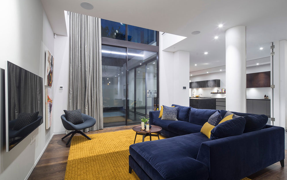 Image source: Tony Murray Photography
When decorating with warm and cool colors, you need to know that each hue will vary depending on the amount of black and white that we added to transform the shades and hues.
Usually, when you make a room lighter, it becomes cooler. In the same way, a small dose of rich and dark tones will make it warmer.
Warm colours
 Image source: Martha O’Hara Interiors
As I said, red, yellow and orange are the colors that are considered warm and they have an overall energizing effect on our mind and body (increase in adrenaline, increase in blood pressure, increase in breathing rate and temperature, etc.). The stronger they are, the stronger this effect becomes.
It is believed that this is the driving force behind famous brands and campaigns that mark incredible success in this consumer society, such as Coca-Cola and Ferrari.
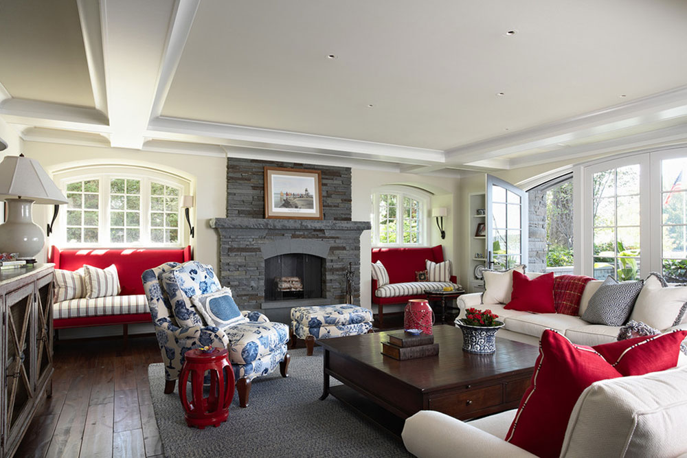 Image source: Billy Beson Company
Therefore warm colors should be used in social spaces, in rooms where you cook, receive guests or where your children play and learn.
The strategy has been well received by famous bars and restaurants that are successful because they use colors to make people feel welcome and comfortable.
Cold colors
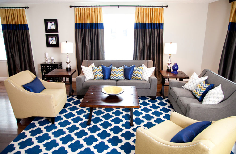 Image source: Sarah Kidder Design
Cool colors, for example blue, have a calming and calming effect. While warmer hues are reminiscent of sun and heat, cooler tones are best associated with water and sky.
Obviously, we need such a calm atmosphere in many rooms to keep our thoughts organized and our minds sharp.
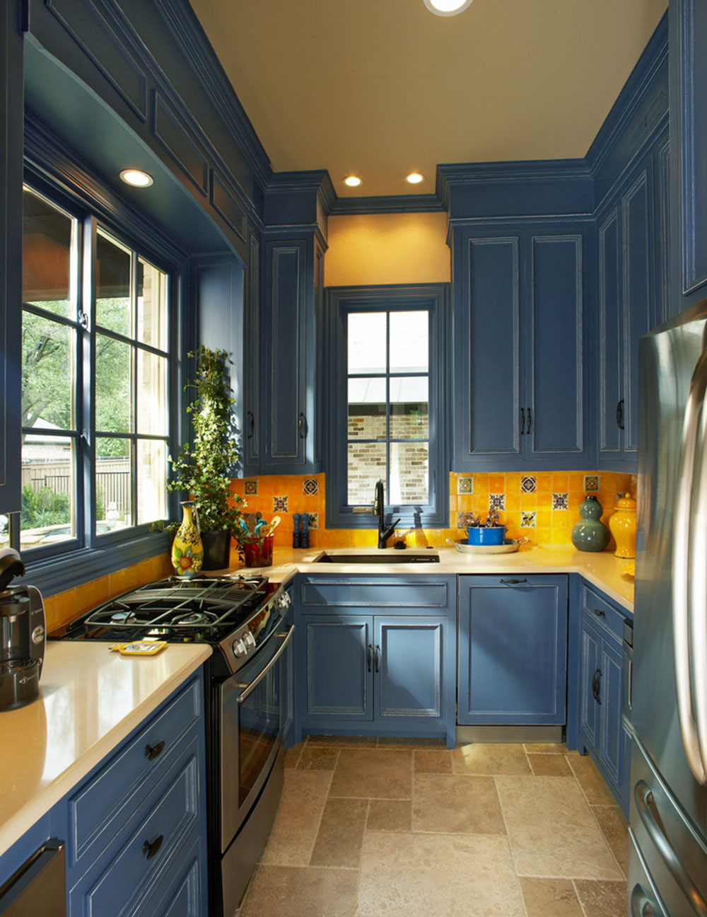 Image source: Michael Lyons architect
This turns blue into the ultimate business choice for both uniforms and interiors (think the police or the clerks at your local bank).
Blue and green are the usual colors in important institutions, offices or parts of the logos of clubs and associations that want to appear organized and reliable.
The role of black and white
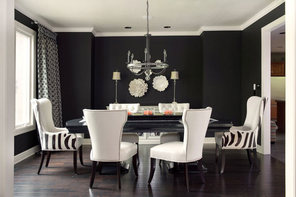 Image source: Kathleen Ramsey, Allied ASID
As you probably know, black and white are not considered to be real colors (black stands for all colors while white stands for no color at all) but that doesn’t prevent them from having their own cool / warm properties.
Many people are surprised to find out, especially when they understand that for the decoration of their homes it is important to know:
White is the cool thing.
Black is the warm.
Unexpected, isn’t it?
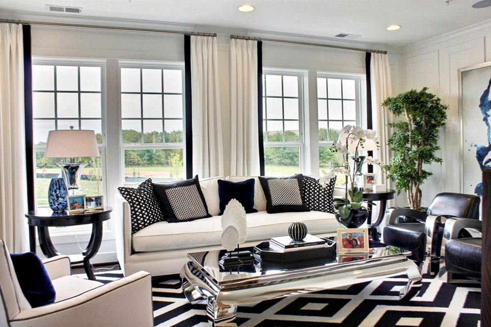 Image source: M / I houses
It means that your safe white choice for painting an entire room is cool and you need to think of playful and colorful accessories to make it comfortable and inviting.
Black, on the other hand, is naturally warm and you should use it with care so as not to overpower it. The contrast between the two is a classically good choice.
With brown
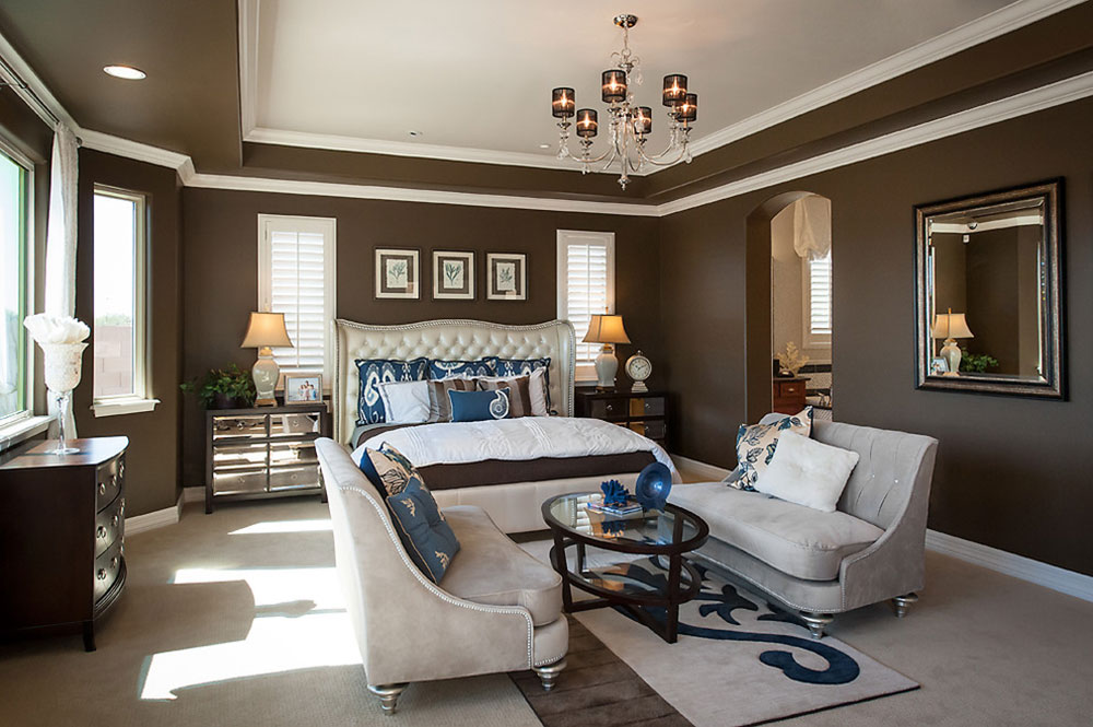 Image source: Maracay Homes Design Studio
Brown is kind of natural, and in the world of design, sometimes that’s enough to make a place warm and comfortable. It’s not a color itself, but a combination of black, yellow, red, orange, green, or even purple.
Due to this fact, brown is considered a neutral choice, reminiscent of pleasant things (chocolate, coffee, etc.) and nature. Psychologically, brown is a relaxing color that makes us feel safe and secure. Therefore, most of the time, people use them at home.
Warm brown solutions are used because of their welcoming character, something like polished beautiful parquet flooring that exposes your welcoming spirit and excellent taste. Unpolished wood or similar textures work well for rustic rooms.
Balance
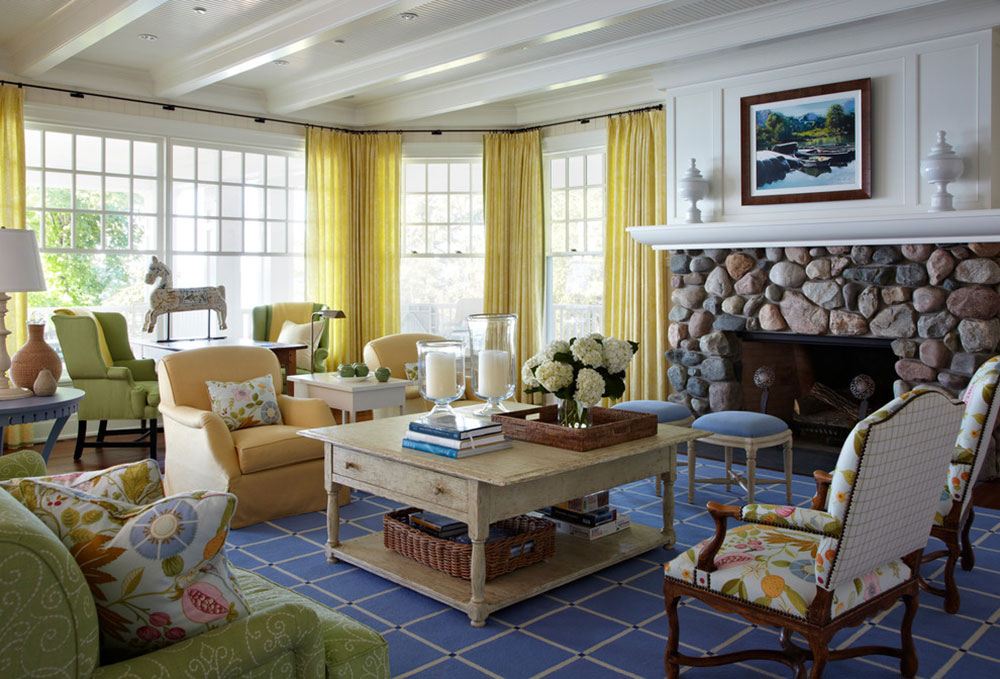 Image source: Tom Stringer design partner
In terms of both warm and cool colors, you shouldn’t limit yourself to a single one. For cozy and homely places where warm colors dominate, there should be at least one cool shade to improve visual balance.
The same is true in the opposite situation, both for balances and for contrasts.
Think about the overall flow of your space to effectively apply both warm and cool colors. Try to estimate the impact of neighboring rooms, their specific shortcomings and characteristics, access to light and size restrictions.
Make the experience more fun by using appealing contrasts, something like a warm vanilla wooden shelf on a wall painted dark blue.
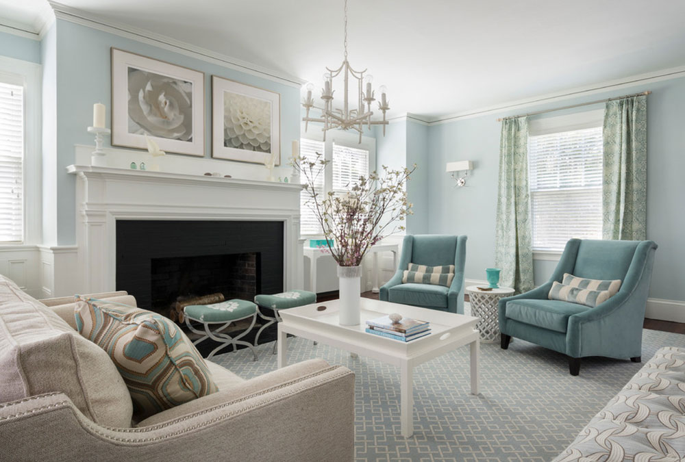 Image source: Digs Design Company
Colors are the essence of dynamics, and their “temperature” is an accurate measure of how much people would enjoy looking at them.
Your color choice should depend on the mood you want to evoke. If you are looking for a shy and intimate place, go for warm tones instead of cool ones. If you want serenity, your solution is blue!
When choosing the color temperature, first think about the size of the room. Warm and light nuances in small spaces are a bit claustrophobic, while cool visual spaces add airiness.
80/20 rule
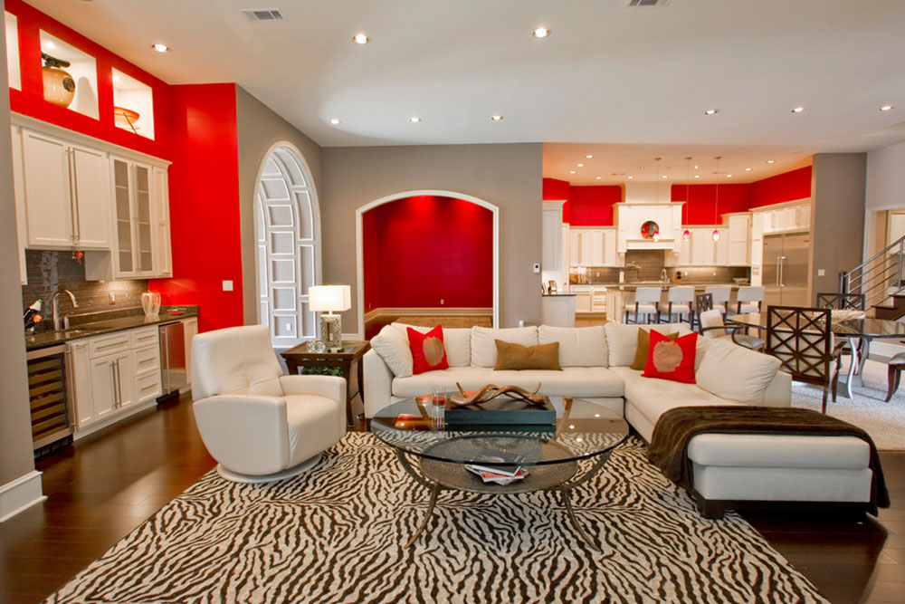 Image source: 3wiredesigns
Don’t forget: strong colors should be used sparingly to punctuate a room, not to fully define it. The universal design recommendation is 80% of the neutral colors combined with 20% of the stronger ones.
In fact, the theory is similar to makeup: only a small part of a woman’s face is covered in red lipstick, the rest is pale and neutral. This is how you also balance rooms.
The 80/20 rule says that colors play an essential role in any room and that it depends exactly on whether a room attracts attention or not.
That’s why it’s good to use them on accent surfaces like walls, soft carpets, large curtains, or even chairs. Colors are just strong enough to give the room everything it needs to be attractive. And that’s nothing more than 20% strong colors and 80% neutral colors.
Color psychology
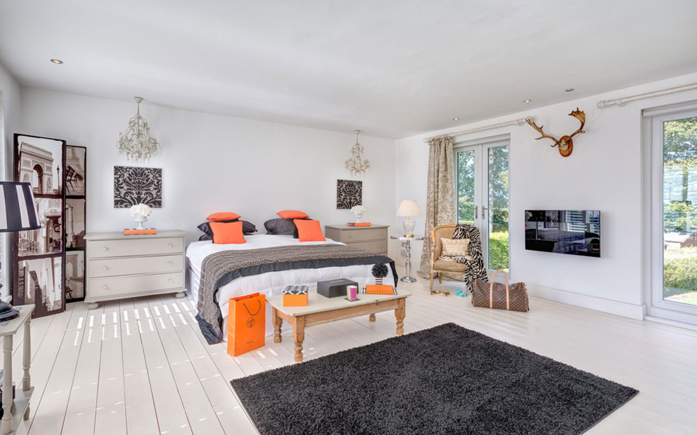 Image source: Colin Cadle Photography
Sounds complicated now, but color psychology is one of the things people especially remember when decorating their homes. The same goes for the fundamental separation between warm and cool colors and the hybrid results that can be achieved when blending.
Getting to grips with the basic principles of color psychology is important in order to maintain a space that evokes the exact feelings we would like to have while spending our time there.