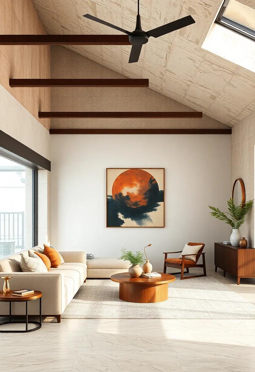
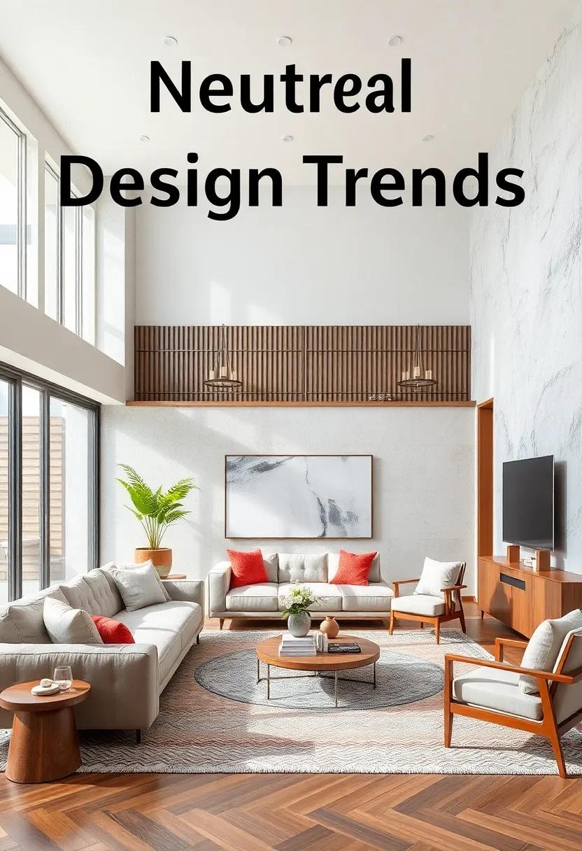
In a world where bold statements often dominate the design landscape, a subtle shift towards harmony and restraint is quietly transforming our living environments. Embracing balance through neutral design trends offers a refreshing perspective-one that celebrates simplicity and serenity without sacrificing style. This approach invites us to explore how muted palettes, natural textures, and understated elegance are reshaping modern spaces into timeless sanctuaries. Join us as we delve into the nuances of neutral design, uncovering the elements that make balance not just a trend, but a way of creating rooms that breathe calm and cohesion.
Embracing Subtle Color Palettes That Foster Calm and Serenity in Contemporary Living Spaces
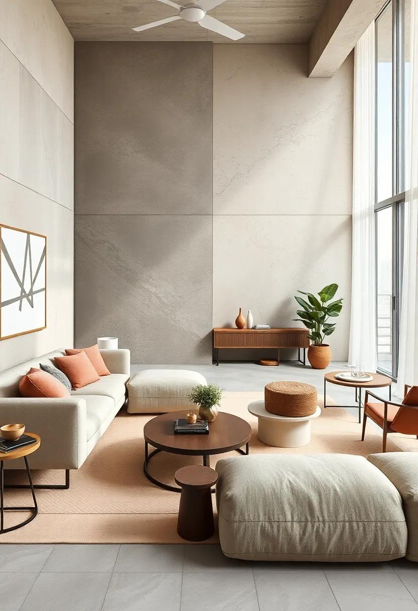
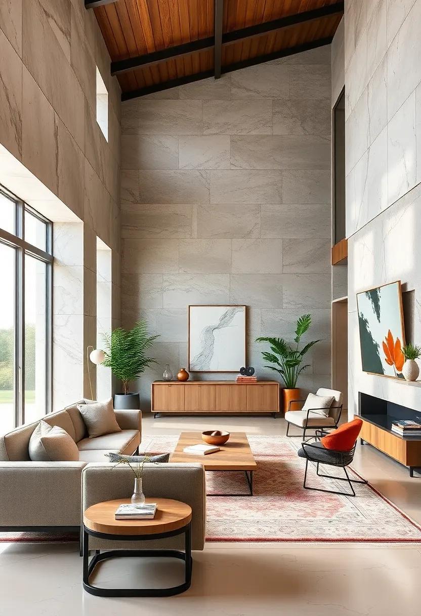
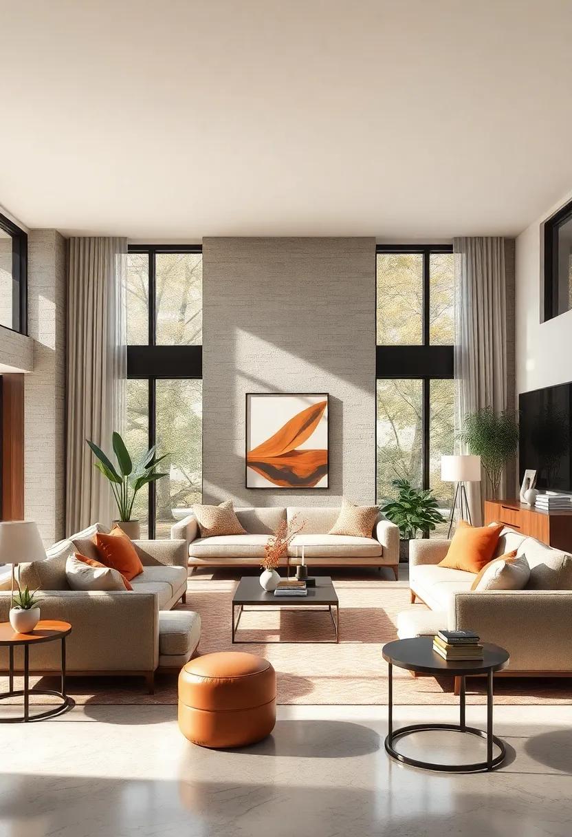
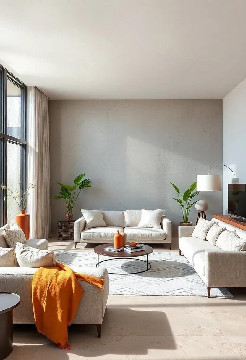
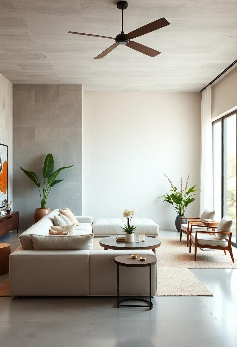
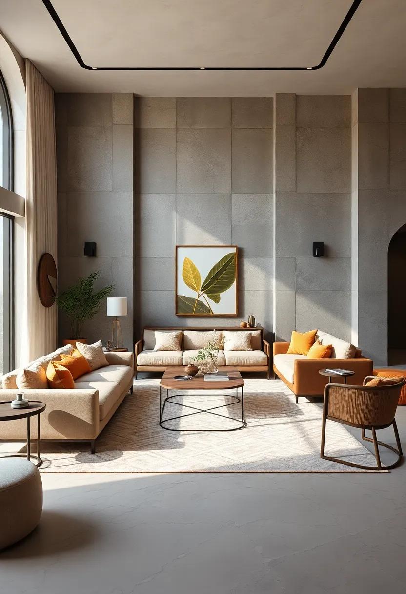
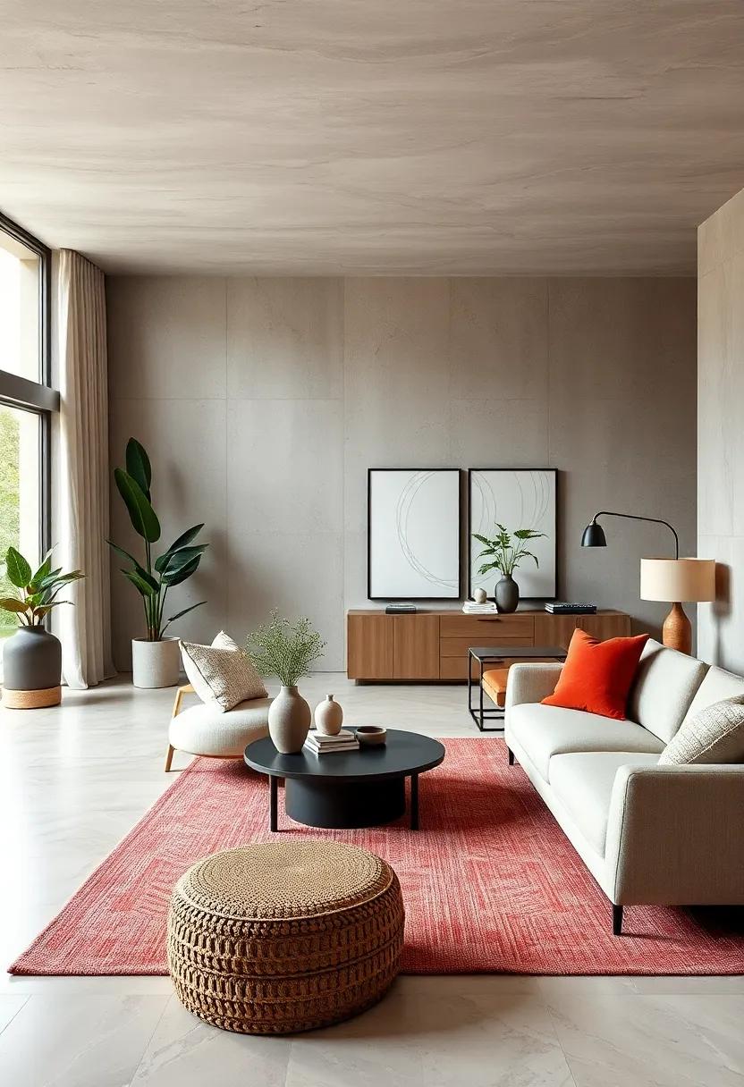
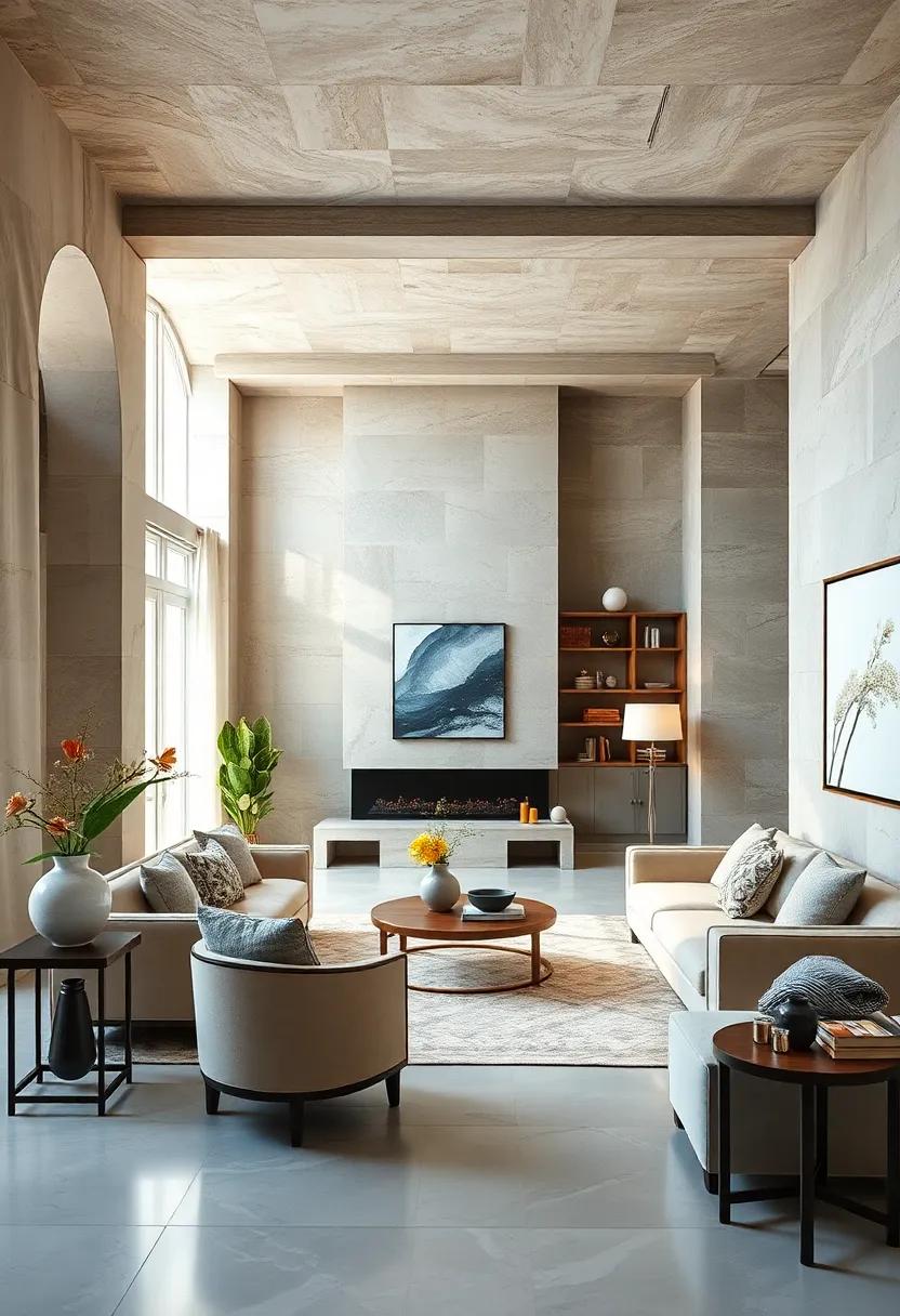
In contemporary interiors, subtle color palettes emerge as the quiet heroes of design, weaving a tapestry of calmness that invites relaxation and mindfulness. These hues – think soft beiges, muted greys, gentle taupes, and dusty pastels – do more than just blend into the background. They create a serene atmosphere that gently balances light and shadow, giving rooms a sophisticated yet approachable charm. By embracing these understated tones, spaces are transformed into peaceful sanctuaries where every element feels intentional and harmonious, allowing occupants to recharge without sensory overload.
The beauty of subtle palettes lies in their adaptability and timelessness. They pair effortlessly with natural textures like linen, wood grain, and stone, and serve as the perfect canvas for bolder accents or artisanal decor pieces. Below is a quick guide showcasing popular calming hues and their emotional benefits, perfect for anchoring your next design project:
| Color | Emotional Benefit | Best Used With |
|---|---|---|
| Warm Taupe | Comfort and stability | Earth tones & Natural Fibers |
| Soft Grey | Balance and neutrality | Metallic accents & Textured rugs |
| Blush Pink | Subtle warmth and optimism | Light wood & Cream textiles |
| Pale Sage | Refreshing calm and renewal | Wicker baskets & Green plants |
- Tip: Layering these colors creates depth without overwhelming the senses.
- Design Hack: Use matte finishes to enhance softness and avoid visual clutter.
- Natural Light: Maximize daylight to bring out the gentle tones’ true warmth.
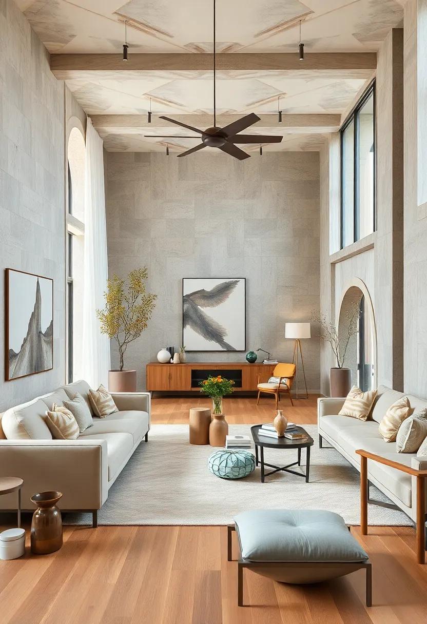
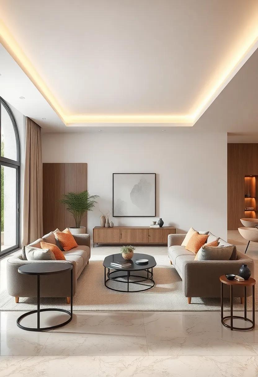
Harmonizing Natural Light to Enhance Neutral Tones and Create Inviting, Balanced Interiors
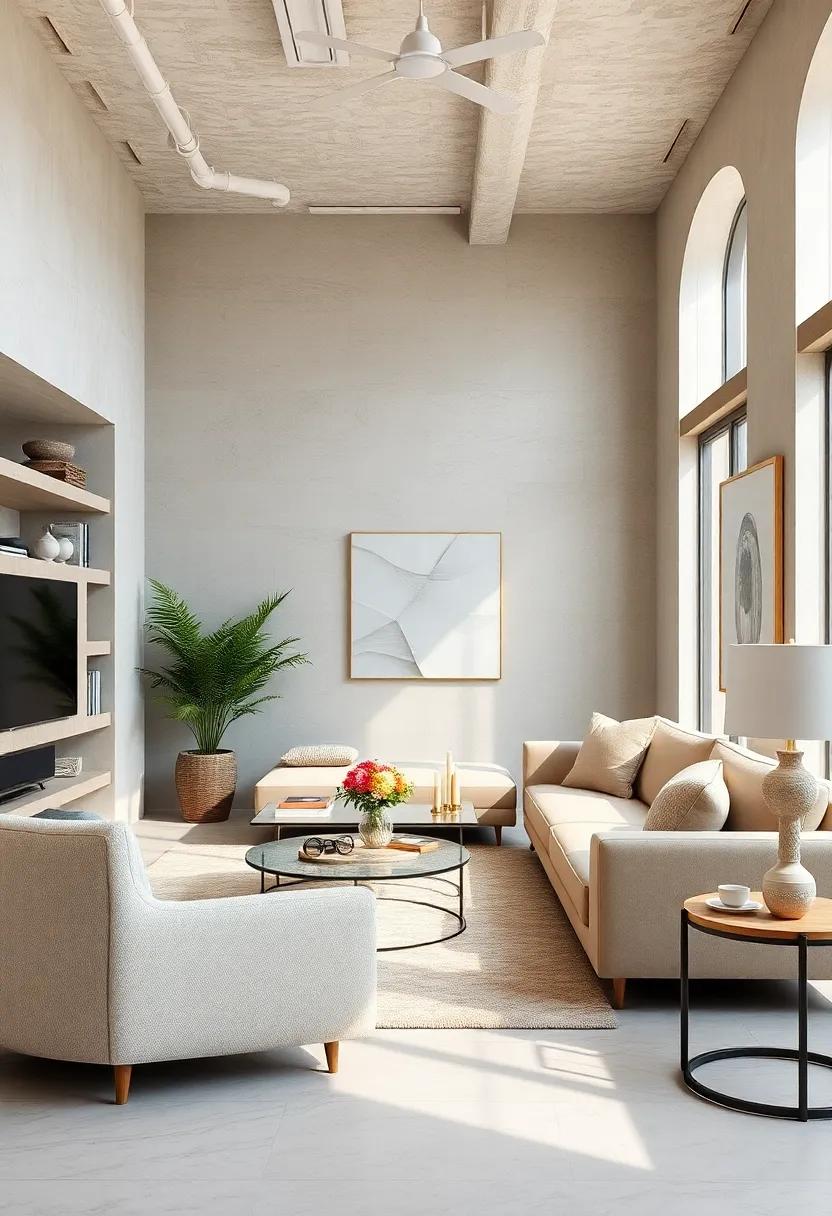
Natural light serves as the perfect companion to neutral color palettes, breathing life and subtle dynamism into interiors without overwhelming the senses. When strategically harnessed, sunlight enhances textures and softens the muted hues, creating a serene atmosphere that feels both expansive and intimate. Whether it gently filters through sheer curtains or cascades across minimalist furnishings, natural light acts as a design element that accentuates the gentle complexities of beige, taupe, and ivory tones, fostering a calm yet invigorating space.
To maximize harmony within neutral interiors, consider these practical techniques:
- Layer window treatments: Combine light-filtering blinds with translucent drapes to control the intensity and direction of sunlight.
- Use reflective surfaces: Incorporate glass, mirrors, or polished metals to bounce natural light deeper into the room.
- Choose varied textures: Pair matte finishes with subtle sheens to add depth and interest under shifting daylight.
Exploring Soft Textures and Fabrics That Complement Minimalist Neutral Design Trends
In minimalist neutral design, texture becomes the unsung hero, lending depth and tactile intrigue to otherwise restrained palettes. Embracing soft materials like linen, velvet, and cashmere invites a comforting warmth that balances the clean lines and muted hues characteristic of neutral spaces. These fabrics naturally absorb light and highlight subtle shadow play, transforming simple corners into intimate, inviting retreats. Incorporating elements such as boucle throws or suede cushions can elevate a room from flat to multidimensional, proving that restraint need not be synonymous with stiffness.
To effectively pair these textures, focus on a curated selection that complements rather than competes with your base elements:
- Linen: Breathable and light, ideal for curtains and sofa covers.
- Velvet: Adds richness and depth, perfect for accent chairs or throw pillows.
- Wool and Cashmere: Cozy and luxurious choices for blankets and area rugs.
- Suede: Soft yet durable, excellent for small upholstery details.
| Fabric | Best Use | Texture Profile |
|---|---|---|
| Linen | Window Treatments | Light, breathable, natural weave |
| Velvet | Accent Upholstery | Soft, reflective, plush |
| Cashmere | Throws & Throws | Luxurious, smooth, warm |
| Suede | Accent Details | Matte, soft, velvety |
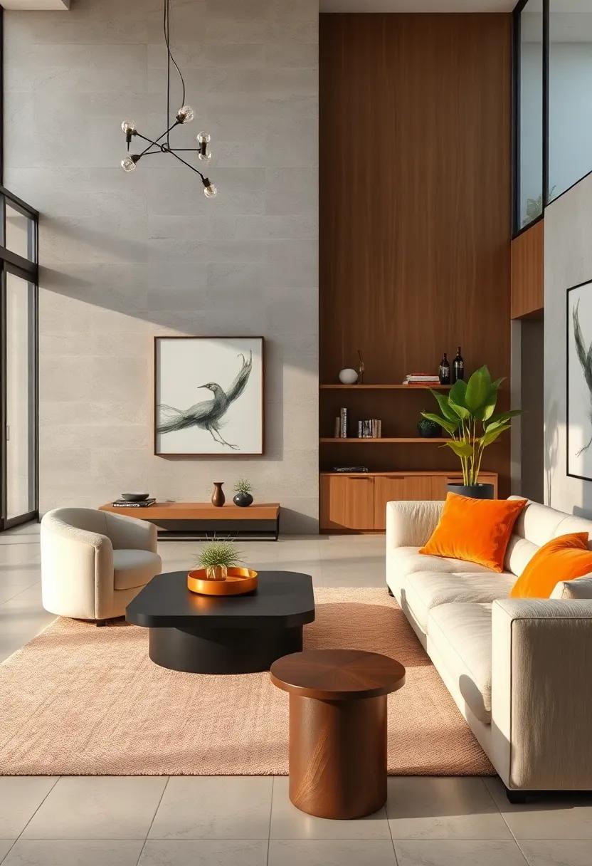
Incorporating Organic Shapes and Lines to Soften Modern Neutral Interiors with Natural Elegance
To enliven a neutral palette without overpowering subtlety, integrating organic shapes and flowing lines can introduce a soothing rhythm to modern interiors. Curved silhouettes in furniture and decor-such as rounded ottomans, wavy wall art, or fluid wooden accents-offer a tactile softness that contrasts beautifully with the clean edges commonly found in contemporary design. This juxtaposition eases the rigidity of minimalism while maintaining a sense of refined restraint. By echoing forms found in nature, these elements breathe a gentle vitality into the space, inviting a relaxing yet invigorating atmosphere that feels effortlessly elegant.
Consider the impact of natural textures combined with these shapes for a holistic approach. Incorporating artisan-crafted pieces like handwoven baskets, driftwood sculptures, or undulating ceramics not only reinforces the theme of fluidity but also adds dimensional warmth. The key lies in balance-letting these organic accents stand out while complementing neutral tones in shades of beige, ivory, or muted greens. Below is a simple guide to harmonizing organic elements with neutral interiors:
- Furniture: Choose sofas with rounded arms or coffee tables with asymmetrical edges.
- Accessories: Incorporate curvaceous vases, lamps with sinuous bases, or soft-edged mirrors.
- Materials: Opt for raw woods, natural fibers, and hand-finished ceramics to enhance texture variety.
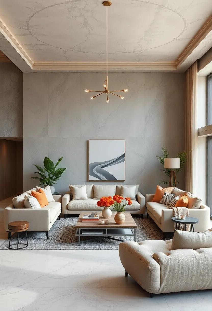
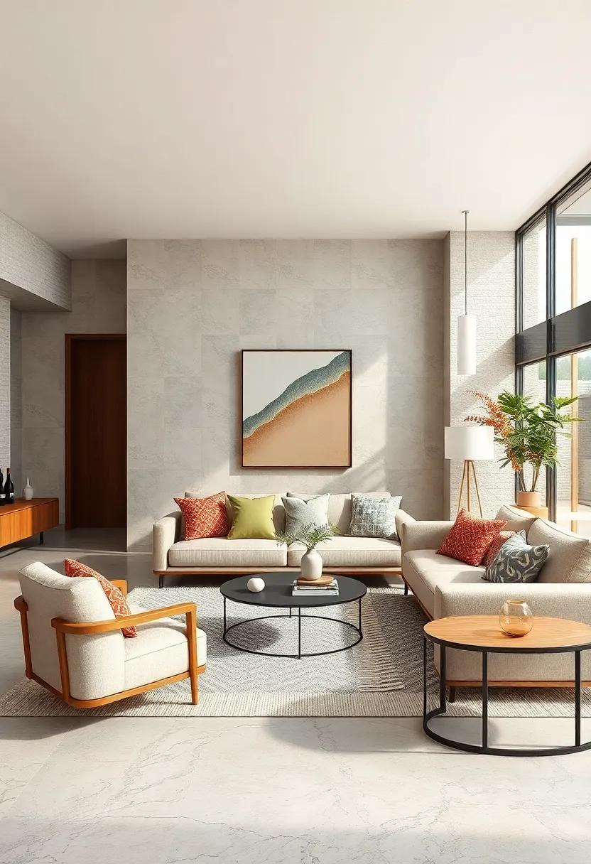
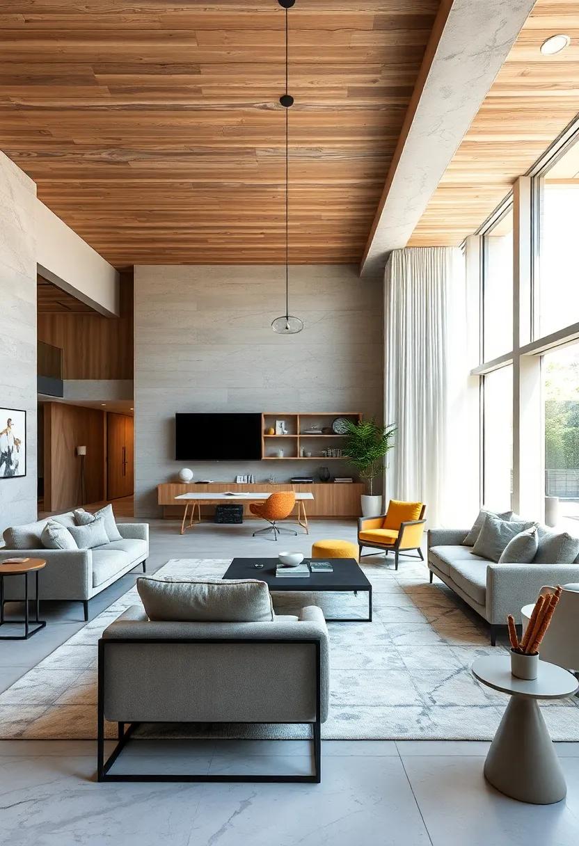
Blending Warm and Cool Neutral Hues for Dynamic Yet Balanced Interior Environments
Combining warm and cool neutral tones introduces a captivating duality that energizes interiors without overwhelming the senses. Warm shades like soft taupes and creamy beiges inject coziness and approachability, while cool hues – think silvery grays and muted blues – offer a calming counterpoint that elevates sophistication. This interplay creates rooms that feel both inviting and refreshing, appealing to a broad spectrum of moods and functions. The key to success lies in balancing their undertones so neither overshadows the other, allowing the space to breathe with subtle depth and character.
To achieve this harmonious blend, consider layering textures and finishes that emphasize the nuances within neutral palettes. Here are some expert styling tips to integrate warm and cool neutrals seamlessly:
- Textile contrasts: Pair cozy, woolen throws or plush velvet with sleek linen or cotton fabrics.
- Metal accents: Combine warm brass or gold fixtures with cool steel or chrome elements for visual intrigue.
- Natural elements: Incorporate wood with warm undertones alongside stone or concrete in cooler shades to ground the space.
- Lighting: Use adjustable white lights to shift the ambience, accentuating warm tones during evenings and highlighting cool hues in daylight.
| Element | Warm Neutral | Cool Neutral |
|---|---|---|
| Wall Paint | Soft Almond | Stone Gray |
| Upholstery | Butterscotch Velvet | Misty Blue Linen |
| Flooring | Honey Oak Wood | Smoked Concrete Tile |
| Accessories | Burnished Brass | Brushed Nickel |
Layering Different Shades of Neutral Colors to Add Depth and Interest Without Overpowering Spaces
Embracing a palette of neutrals doesn’t mean settling for monotony. By thoughtfully blending a variety of soft beiges, warm taupes, and cool grays, you create a visual tapestry that breathes life into any room. This technique invites subtle shifts in hue and tone, drawing the eye around the space without overwhelming it. The secret lies in balancing the undertones-mixing creamy off-whites with hints of sandy caramel or gentle stone grays-to foster a harmonious yet dynamic atmosphere that feels both cozy and sophisticated.
To truly master this layered approach, consider incorporating:
- Textural contrasts: Combine smooth matte walls with plush textiles or weathered wood for tactile intrigue.
- Light variation: Utilize natural and artificial lighting to emphasize the nuances between shades.
- Accent hues: Subtle pops of muted metallics or dusty pastels add a refined sparkle without stealing the show.
This interplay of depth and restraint transforms neutral interiors into captivating sanctuaries, proving that understated colors can tell a rich and compelling story.
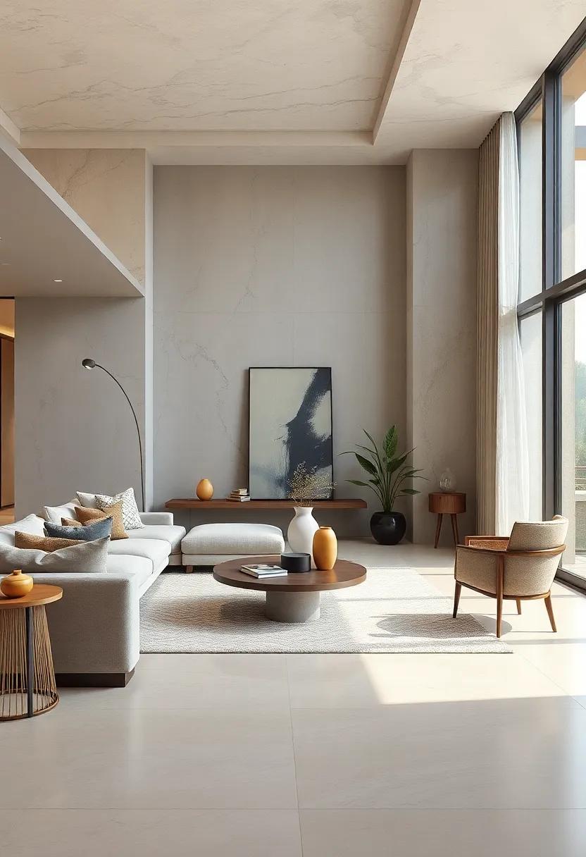
Crafting Visual Harmony Through Thoughtful Use of Negative Space in Neutral-themed Rooms
In neutral-themed rooms, negative space acts as an invisible designer, silently orchestrating the room’s flow and visual comfort. By intentionally leaving areas free from furniture and decor, this blank canvas highlights the subtle textures and muted tones that define the palette. Negative space is not emptiness but a breathing zone that creates contrast, allowing key elements like a sculptural chair or a soft wool rug to emerge as focal points without overwhelming the senses. This balance between presence and absence invites a feeling of calm, encouraging the eyes to rest and the mind to relax.
To master this visual harmony, consider these mindful strategies:
- Scale and spacing: Choose furnishings with clean lines and leave generous gaps to avoid clutter.
- Layering subtle contrasts: Use varying shades of beige, taupe, and ivory with textures like linen or rattan for depth.
- Purposeful voids: Designate intentional empty zones near windows or art pieces to enhance natural light and focus.
| Design Focus | Function of Negative Space | Impact |
|---|---|---|
| Seating Arrangement | Creates visual breathing room | Enhances comfort and accessibility |
| Wall Art Placement | Provides focus and highlights | Amplifies aesthetic appeal |
| Floor Space | Defines zones without barriers | Encourages flow and openness |
Highlighting Statement Furniture Pieces in Muted Colors That Anchor Neutral Design Concepts
In modern interiors where subtlety reigns supreme, choosing furniture pieces in muted tones allows for a harmonious yet compelling visual flow. These understated hues-ranging from soft greys, beiges, to gentle pastels-serve as the perfect foundation, granting spaces a grounded feel without overpowering other design elements. When these furniture essentials are thoughtfully selected, they become the anchors that invite a calming presence, balancing out both bold accessories and minimalist surroundings. This approach not only enhances the spatial rhythm but also adds a layer of timeless elegance, ensuring versatility as trends evolve.
Key to mastering this aesthetic is understanding which muted shades bring both warmth and depth. Consider the following benefits of integrating muted furniture within neutral concepts:
- Creates visual cohesion: Unifies diverse textures and materials while maintaining a clean palette.
- Promotes tranquility: Encourages relaxation by avoiding harsh contrasts or overly vibrant colors.
- Flexibility: Seamlessly pairs with vintage, modern, or eclectic styles.
| Muted Color | Ideal Furniture Piece | Effect |
|---|---|---|
| Dusty Blue | Upholstered Armchair | Softens room edges |
| Warm Taupe | Solid Wood Coffee Table | Adds warmth and solidity |
| Blush Grey | Sectional Sofa | Balances modernity with comfort |
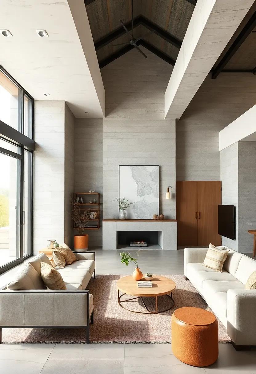
Integrating Wood and Stone Elements to Bring Earthy Warmth into Neutral Modern Spaces
Incorporating natural elements like wood and stone in a neutral modern space is a powerful way to inject warmth and texture without sacrificing minimalist aesthetics. The organic grains of wood add a tactile richness that complements smooth, sleek surfaces, while stone introduces an elemental solidity that grounds the entire design. Consider using reclaimed wood for accent walls or furniture pieces to evoke character and history, paired with polished stone countertops or subtle stone tile backsplashes to balance warmth with refinement. These materials leverage nature’s authenticity, creating tranquil, inviting environments that resonate with understated sophistication.
To seamlessly blend these earthy elements, focus on a palette that harmonizes soft beiges, greys, and off-whites, allowing wood’s golden hues and stone’s cool neutrals to shine. Layer textures through a mix of finishes: matte, honed, or rough stone surfaces combined with smooth, aged, or live-edge wood deliver visual interest and depth. Here’s a quick guide to pairing finishes within neutral modern spaces:
- Light oak (satin finish) with honed limestone for airy, natural vibes
- Walnut (matte finish) with textured slate for dramatic contrast
- Reclaimed pine (distressed finish) with polished marble for balanced character
Balancing Matte and Glossy Finishes to Create Sophistication and Subtle Contrast in Neutral Settings
Incorporating both matte and glossy finishes within a neutral palette allows designers to craft spaces that evoke depth and dynamism without overwhelming the senses. Matte surfaces offer a soft, understated background that absorbs light and invites touch, creating a cozy, grounded atmosphere. Meanwhile, glossy elements act as subtle focal points, reflecting light strategically to add sparkle and dimension. The key lies in thoughtful placement and proportion-too much gloss can feel cold, while excessive matte may risk flatness. Striking this equilibrium transforms simple neutrals into a sophisticated canvas where texture speaks louder than color.
To master this balance, consider these design tips:
- Pair matte wall finishes with glossy trim or fixtures to delineate space elegantly.
- Use glossy ceramic or glass accessories against matte furniture to inject vitality.
- Alternate between matte and polished wood surfaces in flooring and cabinetry for tactile contrast.
- Introduce soft textiles with subtle sheen to soften the interplay further.
- Leverage lighting to enhance glossiness in strategic zones, amplifying depth without glare.
| Finish | Effect | Ideal Use |
|---|---|---|
| Matte | Soft, understated, absorbent | Walls, ceilings, large surfaces |
| Glossy | Reflective, dynamic, brightening | Accents, fixtures, decorative elements |
Designing Open Floor Plans That Maximize Flow While Accentuating Neutral Design Principles
Seamless circulation is the cornerstone of an effective open floor plan, where space feels unrestricted yet intimately connected. This balance is achieved by carefully positioning furniture to create natural pathways, avoiding overcrowding, and using subtle visual cues to guide movement. Incorporating varied ceiling heights or changes in flooring texture can also distinguish zones without sacrificing openness. Within these spaces, neutral color schemes serve as the visual glue, allowing light to bounce and amplify spaciousness while maintaining an elegant, calm backdrop.
Key elements to focus on:
- Strategic furniture arrangement to define functional areas
- Layering different shades of neutrals – think warm beiges, soft grays, and crisp whites
- Textural contrasts to add depth without color distraction
- Minimalist décor that complements rather than competes
| Design Principle | Implementation | Effect on Flow |
|---|---|---|
| Visual Continuity | Matching flooring across rooms | Eliminates barriers, fostering fluid movement |
| Subtle Zoning | Area rugs or lighting changes | Defines spaces while preserving openness |
| Neutral Palette | Soft, muted tones with natural materials | Highlights architectural features, keeps mood serene |
Using Monochromatic Schemes with Varying Textures to Develop Rich, Layered Neutral Interiors
Achieving depth in a neutral palette is not about relying solely on color but embracing the tactile interplay of surfaces. When working within a monochromatic scheme, texture becomes the primary vehicle for visual interest and dimension. Imagine the soft embrace of a linen sofa paired with a rugged jute rug, the subtle sheen of a silk throw contrasting with the coarse grain of reclaimed wood furniture. This dance of textures enhances the sensory experience, inviting you to not just see the space but to feel it. Through thoughtful layering, neutrals transcend simplicity, offering rooms that are simultaneously tranquil and captivating.
To orchestrate this harmonious textural symphony, consider integrating elements such as:
- Matte walls combined with glossy ceramic accessories
- Velvet cushions against woven baskets or rattan chairs
- Leathery finishes juxtaposed with soft cotton throws
- Textured plaster against sleek, polished metals
Each pairing plays a crucial role not only in elevating the aesthetic but also in cultivating a tactile richness that anchors the space. The result is a modern, nuanced interior where calmness thrives, and every surface tells a story.
| Texture Type | Effect | Example Elements |
|---|---|---|
| Soft | Comfort & Warmth | Linen, Velvet, Cotton throws |
| Rough | Organic & Earthy | Jute rugs, Woven baskets, Reclaimed wood |
| Glossy | Elegance & Light Reflection | Polished metals, Ceramics, Glass vases |
| Matte | Subtlety & Mute Tones | Plaster walls, Unfinished timber, Chalk paints |
Elevating Neutral Spaces with Strategic Pops of Light Metallic Accents for Understated Glamour
Infusing neutral interiors with light metallic accents creates a compelling narrative of subtle luxury without overwhelming the space. Think of these touches as visual punctuation-delicate reflections on surfaces that draw the eye and add dimension. Whether it’s a brushed gold lamp, a silver-framed mirror, or a soft rose gold vase, these elements effortlessly transform muted palettes into sophisticated showcases of modern elegance. This approach embraces restraint, opting for a refined sparkle rather than bold statements, allowing the calmness of neutral tones to remain the foundation while the metallics provide a whisper of glamour.
To master this balance, consider incorporating metallics in key areas where light naturally bounces or where focal points exist. Here are practical ways to enhance your space:
- Minimalist light fixtures: Softly illuminated metallic pendants or sconces create an ambient glow.
- Decor accessories: Trays, bowls, or picture frames in pearlized or matte metal finishes offer subtle shine.
- Furniture with metallic details: Tables or chairs with metallic legs or accents blend function with aesthetic appeal.
| Metal Type | Optimal Use | Finish Preference |
|---|---|---|
| Brushed Gold | Lamps, hardware | Matte |
| Silver | Mirrors, frames | Soft polish |
| Rose Gold | Vases, small decor | Satin |
Capturing the Essence of Scandinavian Minimalism Through Crisp Lines and Neutral Palettes
Scandinavian design is a masterclass in restraint, where every edge is deliberate, and every hue whispers calm. The power of crisp, clean lines cuts through visual clutter, creating a sense of order and clarity that feels almost meditative. Walls, furniture, and décor follow a harmonious geometry, emphasizing function without forsaking elegance. Neutral palettes – think soft grays, warm beiges, and icy whites – act as a gentle canvas, allowing natural light and simple forms to shine. This subtle color story provides a foundation where texture and materiality become the stars, inviting tactile experiences while maintaining a calming visual flow.
Embracing this aesthetic means celebrating simplicity not as a limitation, but as freedom. The understated sophistication of Scandinavian minimalism fosters serene spaces where every piece has purpose, from sleek wooden tables to fabric tones that soothe the senses. Key elements that define this approach include:
- Light-filled spaces: Maximizing sunlight to enhance clarity and warmth
- Natural materials: Wood, leather, and linen for organic depth
- Monochromatic layers: Subtle tonal variations for understated complexity
- Functional beauty: Designs marrying practicality with aesthetic grace
| Element | Characteristics | Effect |
|---|---|---|
| Lines | Straight, clean, minimal | Creates structure and clarity |
| Palettes | Neutrals, soft tones | Amplifies natural light and calm |
| Materials | Wood, textiles, metal accents | Adds warmth and tactile contrast |
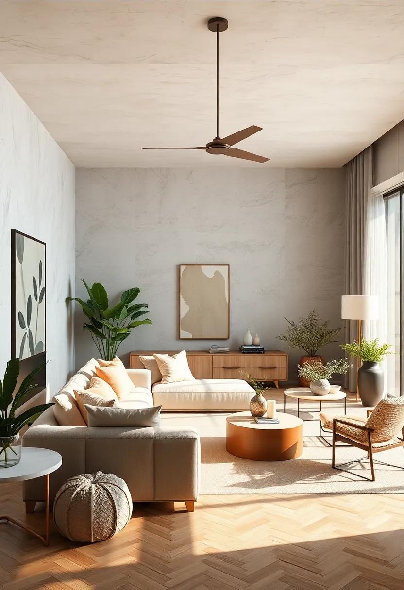
Positioning Greenery and Indoor Plants to Bring Life and Freshness to Neutral-Themed Rooms
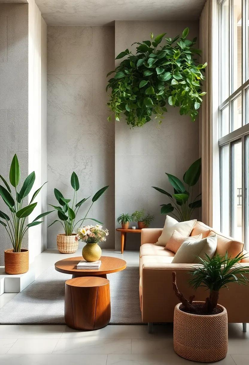
Incorporating greenery into neutral-themed rooms breathes a subtle yet impactful freshness that transforms the ambiance. When selecting plants, consider varieties with diverse leaf shapes and textures, such as the sculptural fiddle leaf fig or the delicate trailing string of pearls. Placing taller plants in empty corners or next to furniture edges creates natural focal points, while smaller pots on shelves or side tables introduce bursts of life without overwhelming the restrained palette. Contrast is key: the lush greens offer a vibrant counterbalance to beige, gray, or off-white tones, enlivening spaces with organic vitality.
- Use varying plant heights to add depth.
- Combine matte and glossy leaf textures for visual interest.
- Strategically position plants near natural light sources to emphasize their hues.
To optimize both aesthetics and air quality, thoughtfully arrange plants in clusters rather than scattering them randomly. A grouping of three to five with varied species and pot sizes becomes an eye-catching green centerpiece, unattainable by a single specimen alone. For surfaces prone to moisture, choose self-watering planters or use decorative trays to protect finishes. The ultimate goal is to harness greenery as a dynamic, living art form that complements the calm neutrality, providing a refreshing sensory connection that invites peacefulness and subtle energy into modern living spaces.
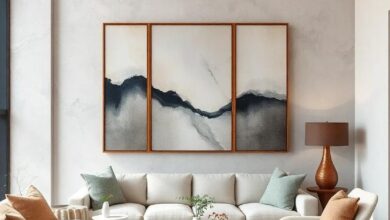
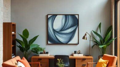
Showcasing Artworks in Muted and Earthy Tones for Cohesion in Balanced Neutral Design Concepts
Incorporating artworks rendered in muted and earthy tones serves as a subtle yet powerful way to anchor a space that revolves around neutral palettes. The soft whispers of ochres, warm browns, and gentle grays create a seamless visual narrative that harmonizes with natural materials like wood and stone. This intentional color curation enhances the tranquil aura of the environment, allowing the space’s architecture and furnishings to dialogue without overpowering one another. Artwork in these hues acts as a connective tissue, binding various design elements into a coherent and inviting story.
When selecting pieces for such balanced environments, consider the following:
- Textures that evoke organic sensations, such as linen canvas or raw-edge framing.
- Subjects that reflect nature’s simplicity – think branches, stones, or abstract landscapes.
- A deliberate restraint in saturation to maintain the serene mood.
| Art Element | Effect | Design Benefit |
|---|---|---|
| Soft Ochres | Warmth | Invites cozy intimacy |
| Warm Taupe | Subtle Sophistication | Keeps the atmosphere elegant |
| Muted Grays | Neutral Calm | Enhances tranquility without dullness |
Through this palette and thoughtful selection, artworks become not just decorative items but essential participants in crafting a balanced and cohesive aesthetic that celebrates the understated beauty of neutral design principles.
Employing Soft, Diffused Lighting to Enhance the Warmth and Coziness in Neutral Living Areas
In the realm of neutral interiors, lighting serves as the defining element that transforms a space from cool and clinical to inviting and intimate. Utilizing soft, diffused lighting techniques breathes warmth into pale palettes and muted tones, creating an atmosphere that feels both serene and snug. Opt for light sources that scatter illumination gently-such as frosted glass fixtures, fabric lampshades, or strategically placed dimmers-to avoid harsh shadows and glaring hotspots. This subtle glow complements natural materials like wood, linen, and stone, highlighting their textures without overpowering the understated color scheme.
To master this effect, layering light sources is key. Combine ambient lighting with accent pieces like table lamps and wall sconces to infuse corners with a gentle radiance. Here’s a quick reference for balancing lighting in neutral living spaces:
- Ambient Lighting: Overhead fixtures with diffusers to spread light evenly.
- Task Lighting: Adjustable reading lamps with warm bulbs.
- Accent Lighting: Soft uplights or wall sconces emphasizing texture.
- Decorative Lighting: Candles or string lights for a touch of sparkle.
Balancing Functional and Aesthetic Elements Seamlessly in Neutral Modern Interior Layouts
Achieving harmony between utility and visual appeal is at the core of designing neutral modern interiors. These spaces thrive on clean lines and a pared-back color palette, yet they must also cater to everyday functionality. Thoughtfully selected furniture plays a pivotal role-offering ergonomic comfort without overshadowing the subtle backdrop. Meanwhile, lighting is curated not only to illuminate but to sculpt moods, adding layers of depth without disrupting the understated theme. The goal is to create an environment where every element, from modular storage solutions to minimalist décor, serves a dual purpose: enhancing usability while reinforcing a serene aesthetic.
Bringing form and function into perfect alignment often involves careful material selection and strategic spatial planning. To assist in this balance, designers frequently turn to essential principles:
- Neutral tones that expand space visually and invite flexibility
- Textural contrasts like soft fabrics against sleek surfaces
- Multifunctional furnishings that blend style with smart storage
- Open layouts that encourage fluid movement and adaptability
| Design Element | Functional Benefit | Aesthetic Contribution |
|---|---|---|
| Floating Shelves | Maximize wall space storage | Minimalist and sleek appearance |
| Monochrome Palette | Creates visual continuity | Elegant, calming atmosphere |
| Soft Area Rugs | Comfort underfoot, zoning areas | Adds subtle texture and warmth |
| Recessed Lighting | Space-saving illumination | Maintains clean ceiling lines |
Combining Industrial and Natural Materials to Create Contrast Within Neutral Interior Block Designs
Harnessing the raw beauty of industrial materials like concrete, steel, and exposed brick creates a striking dialogue when paired with the subtle warmth of natural elements such as wood, linen, and stone. This interplay results in spaces that feel both grounded and refined-where the cool, sleek edges of metal beams or polished concrete floors are softened by organic textures and earthy tones. The beauty lies in the tactile contrast; rough, rugged surfaces meet smooth, gentle finishes, inviting the eye to wander and the hands to explore. This fusion is not merely aesthetic-it speaks to a lifestyle that values both strength and serenity.
- Concrete countertops paired with reclaimed wood cabinetry add authenticity and depth.
- Steel-framed furniture balanced by plush, neutral-hued upholstery offers visual stability and comfort.
- Exposed brick walls softened by woven wall hangings or potted greenery create curated warmth within raw structures.
| Industrial Material | Natural Counterpart | Effect Achieved |
|---|---|---|
| Brushed Steel | Raw Hemp Fabric | Textural Contrast |
| Polished Concrete | Live-Edge Wood | Visual Warmth |
| Exposed Brick | Soft Linen Curtains | Balance of Hard and Soft |
Marrying these disparate materials within a neutral palette allows for subtle shifts in mood and energy without overwhelming the senses. The key to mastering this balance lies in thoughtful layering-each material complements but never competes, creating a visual rhythm that breathes life into minimalist block designs. By embracing this contrast, designers can craft interiors that feel both timeless and contemporary, where the industrial spirit is softened by nature’s touch, turning everyday spaces into artful sanctuaries.
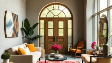
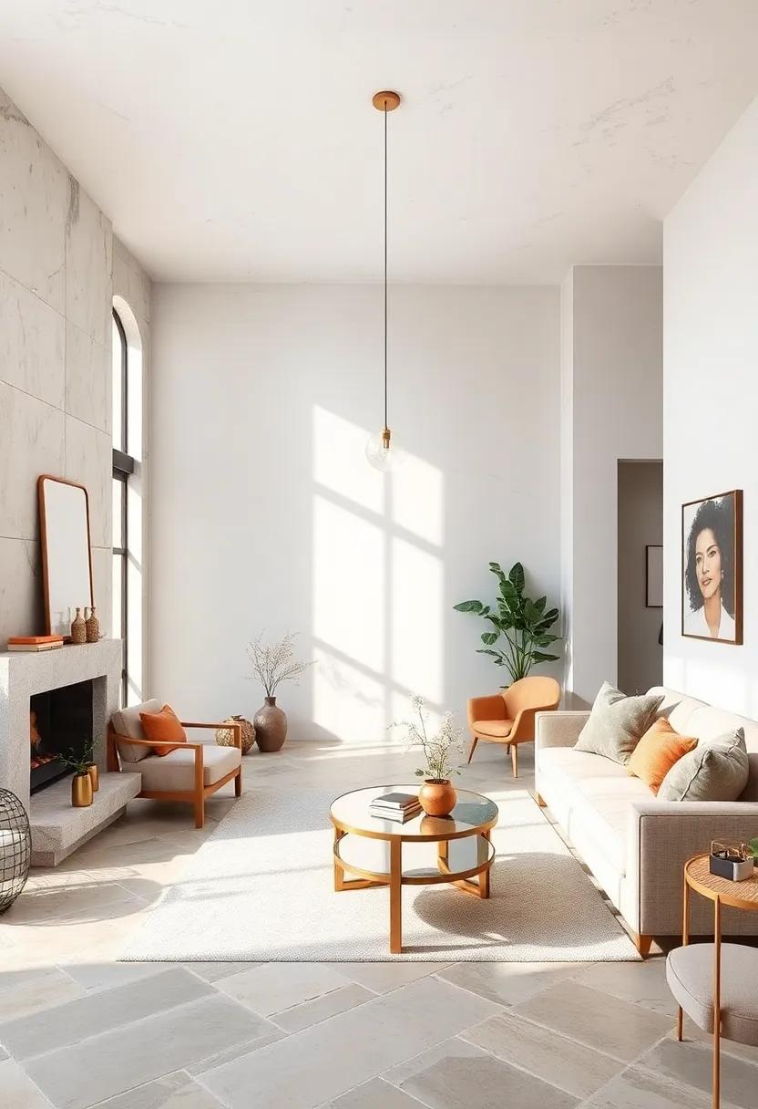
Framing Windows to Maximize Natural Views and Compliment Neutral Interior Ambiances
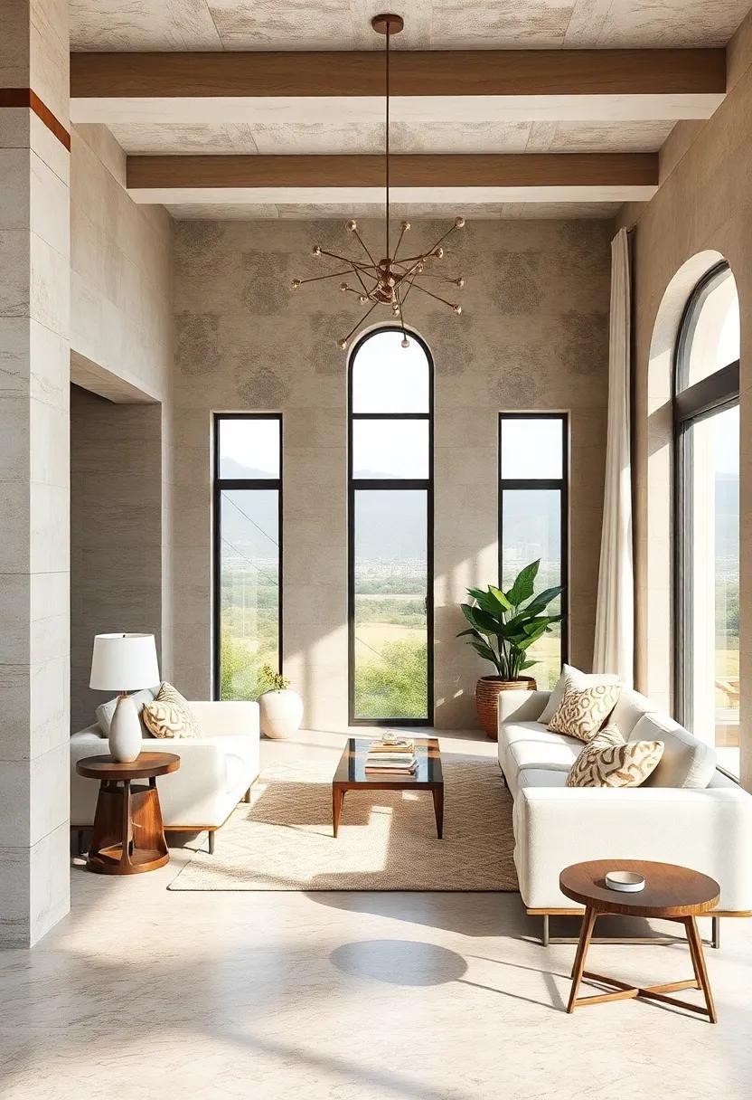
Strategically positioning windows in a room isn’t just about bringing the outdoors in-it’s about framing nature as a living masterpiece that complements a room’s serene, neutral palette. Opting for expansive, unobtrusive window designs allows natural light to cascade freely, enhancing soft taupes, calming greys, and muted whites. Clean lines and minimalist frames become invisible boundaries that anchor the space, gently guiding the eye to lush landscapes or city silhouettes beyond. Selecting window treatments in subtle textures and light-filtering fabrics ensures the views remain uninterrupted while maintaining a harmonious interior glow.
To balance aesthetics and function, consider these essential framing elements:
- Matte finishes: Reduce glare and keep the focus outward.
- Low-profile sills: Minimize visual bulk and maximize floor space.
- Color matching: Frames painted in soft neutrals unify the interior environment.
| Window Style | Effect on Ambiance | Recommended Frame Color |
|---|---|---|
| Floor-to-Ceiling | Seamless connection to the outdoors | Soft Beige |
| Corner Glass | Expands spatial perception | Muted Gray |
| Sliding Panels | Flexible light control | Warm Taupe |
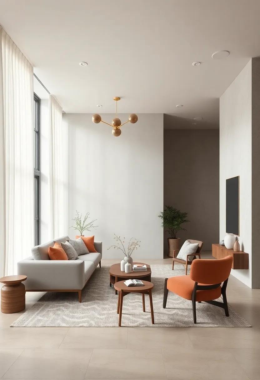
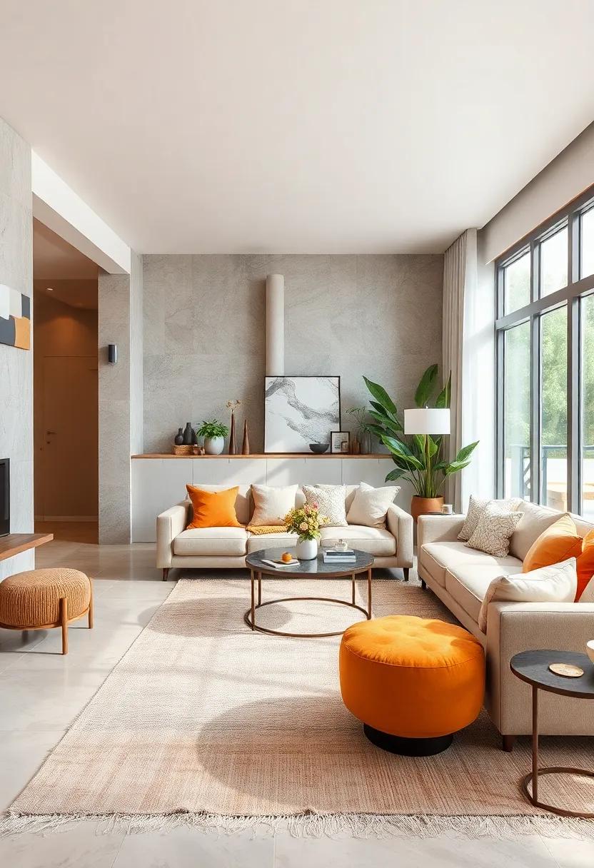
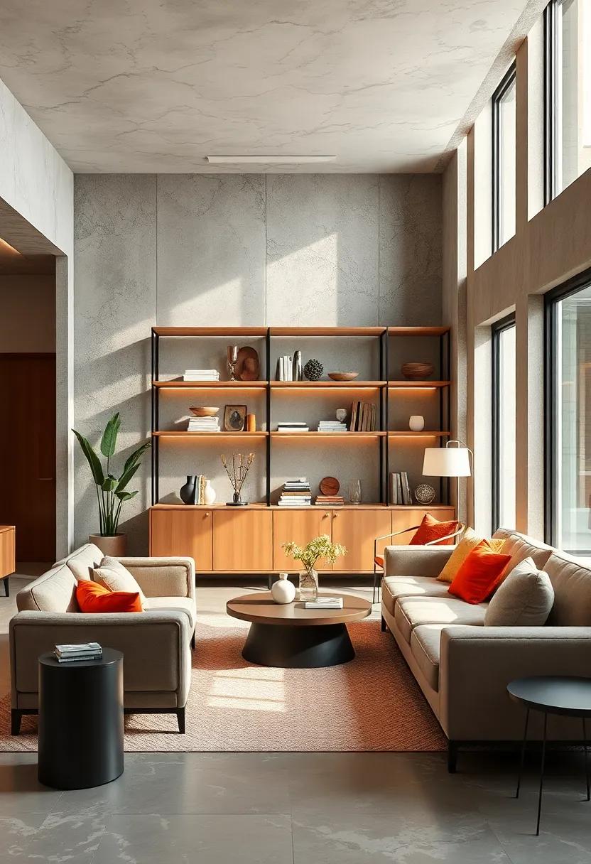
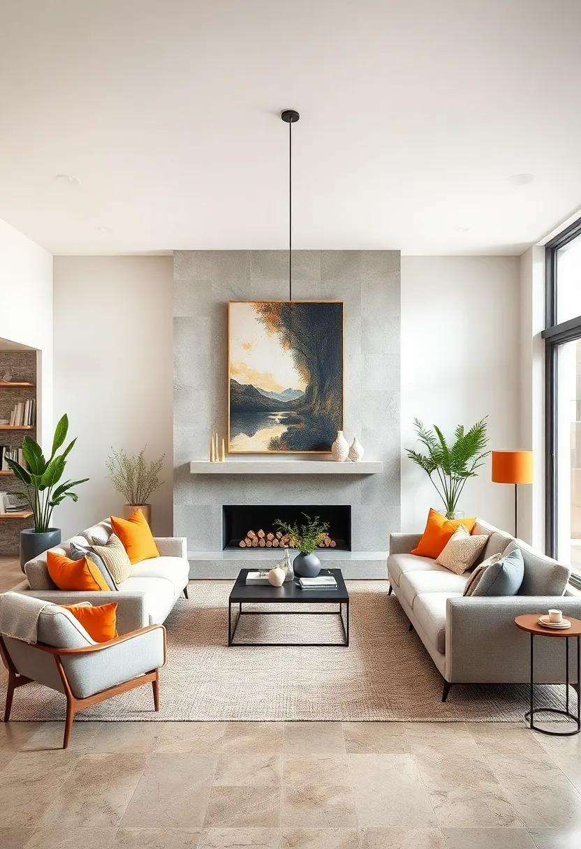
The Role of Neutral Color Foundations in Supporting Bold Accent Pieces Without Losing Balance
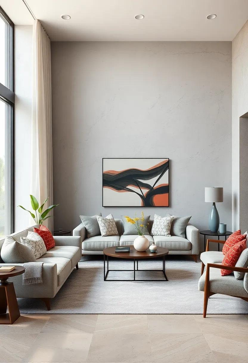
Neutral color foundations, such as soft beiges, subtle greys, and gentle whites, create an essential backdrop that allows bold accent pieces to shine without overwhelming a space. These hues provide a canvas that absorbs color impact gracefully, ensuring that vibrant sofas, statement art, or colorful rugs take center stage while maintaining visual harmony. By balancing intensity with restraint, neutrals foster an environment where creativity and boldness can coexist effortlessly.
Incorporating neutral bases also offers versatility when styling with daring accents. Consider the following benefits:
- Flexibility: Easy to update accents seasonally without committing to new foundational colors.
- Depth: Subtle variations in neutrals can add textural interest beneath bold decor.
- Balance: Creates a calming effect that counterpoints dramatic colorful choices.
| Neutral Foundation | Ideal Bold Accent | Balance Effect |
|---|---|---|
| Warm Beige | Rust Orange Sofa | Inviting Warmth |
| Cool Grey | Electric Blue Art | Modern Contrast |
| Soft White | Vibrant Green Plants | Fresh Energy |
Strategic Placement of Rugs and Carpets to Anchor and Soften Neutral Flooring Choices
Neutral flooring establishes a blank canvas that invites creativity, but it can also risk feeling stark or flat without the right touches. Introducing carefully selected rugs and carpets breathes life into these spaces by anchoring key areas, defining zones, and introducing texture that softens the overall ambiance. Designers often opt for subtle patterns or tonal variations within the rug itself, which creates an understated focal point that harmonizes rather than competes with the neutral base. Layering these soft surfaces thoughtfully creates comfort underfoot and elevates spatial flow, turning simple floors into an experience that feels inviting and deliberate.
- Layer with intention: Place rugs at seating clusters, dining areas, or bedside zones to ground furniture arrangements.
- Blend textures: Combine natural fibers like jute or wool with smoother neutrals to add dimension.
- Keep to a tone-on-tone palette: Choose rugs that play with shades of beige, gray, or cream for a seamless look.
- Consider scale: Large rugs in minimalist patterns can unify a room, while smaller accents highlight cozy corners.
| Rug Style | Best Use | Effect |
|---|---|---|
| Low-pile Wool | Living rooms | Durable, warm, and textured |
| Natural Fiber | Entryways & Dining | Earthy, casual softness |
| Patterned Tonal | Bedrooms | Subtle contrast & visual interest |
| Layered Sheepskin | Reading nooks | Plush comfort & cozy appeal |
Curating Minimalist Shelving and Storage Solutions That Blend Seamlessly in Neutral Interiors
Minimalist shelving and storage are the unsung heroes of neutral interiors, quietly anchoring the space while enhancing its airy, cohesive feel. Crafted with clean lines and subtle textures, these pieces serve as functional art – offering a refined, clutter-free experience. Whether it’s floating shelves in pale oak or matte metal frames with tempered glass, the key lies in subtlety. The goal is to present storage that doesn’t disrupt the calm palette but instead adds depth through tonal variations and natural materials, creating a harmonious rhythm across the room.
Consider versatile modular systems that can be effortlessly reconfigured to suit evolving needs without overpowering visual simplicity. Light finishes such as dove gray, soft taupe, or creamy white blend seamlessly with walls and textiles, letting objects themselves become focal points. To aid in choosing the right elements, here’s a quick glance at common materials and their impact in neutral spaces:
| Material | Texture | Visual Effect |
|---|---|---|
| Natural Wood | Warm grain | Softens and adds warmth |
| Matte Metal | Smooth, subtle sheen | Modern and sleek |
| Glass | Transparent, reflective | Lightens and enlarges space |
| Woven Fabric | Textured, tactile | Introduces cozy layers |
Capturing Timeless Elegance Through Classic, Neutral-Inspired Architectural Details
Neutral-inspired architectural details serve as the foundation for spaces that speak quietly yet powerfully, embodying a timeless elegance. The subtle interplay of shades like soft taupe, warm beige, and gentle greys creates a tranquil backdrop, allowing architectural elements to become both the focal point and the frame. Think of crown moldings with smooth, understated profiles, or paneled walls painted in creamy off-whites that invite natural light to dance gently across textures. These elements don’t compete for attention but instead provide a harmonious rhythm, fostering an atmosphere where both modern minimalism and classic craftsmanship coexist effortlessly.
Incorporating neutral tones doesn’t mean sacrificing depth or interest; rather, it encourages a thoughtful layering of materials and forms. Consider the impact of:
- Textured plaster walls that capture light and shadow with subtlety.
- Natural wood trims finished in soft hues, adding organic warmth.
- Matte metals in bronze or brushed nickel, offering refined contrast without overpowering.
- Symmetrical window framing that balances openness and structure.
This curated approach to architectural detailing invites spaces to breathe and evolve, proving that elegance truly lies in simplicity and proportion.
Showcasing Curated Collections of Neutral Home Decor That Evoke Peace and Cohesion
Within the soft embrace of neutral palettes lies a thoughtfully curated world where every piece of home decor contributes to an atmosphere of tranquility and unity. These collections typically blend texture-driven elements like woven linens, smooth ceramics, and natural wood finishes, creating a tactile symphony that appeals to the senses without overwhelming the visual field. Subtle variations in beige, ivory, and muted grays invite balance, allowing spaces to breathe while fostering a cohesive design language that feels timeless and intentional.
The essence of such design lives in the layering of simplicity and detail. Imagine a gentle array of accents harmonizing in understated elegance:
- Matte stone vases paired with soft cotton throws
- Neutral-toned abstract art that enhances spatial flow
- Handcrafted baskets offering both function and flair
The strategic assembly of these elements can be further guided by creating a practical cheat sheet:
| Element | Purpose | Ideal Material |
|---|---|---|
| Soft Textiles | Introduce comfort and warmth | Organic Cotton, Linen |
| Neutral Hues | Establish serene backdrop | Beige, Taupe, Off-White |
| Natural Accents | Add depth and texture | Wood, Stone, Wicker |
Together, these components invite a harmonious dialogue between nature and nurture, offering spaces that effortlessly restore and inspire.
Balancing Scale and Proportion in Neutral Spaces to Avoid Visual Clutter and Foster Calm
In the pursuit of creating serene environments, the art of scale and proportion becomes paramount, especially within neutral palettes. Rather than overcrowding a space, designers emphasize the deliberate placement and sizing of elements to cultivate a sense of harmony and tranquility. A well-balanced room often features a mix of large, grounding pieces paired with smaller, complementary accents, ensuring each element breathes and contributes without overwhelming the senses. Key considerations include:
- Choosing furniture that boasts clean lines and appropriate dimensions relative to the room size
- Maintaining consistent spacing to allow easy visual flow
- Utilizing negative space intentionally to highlight focal points and prevent clutter
To illustrate the balance between scale and proportion in neutral interiors, consider the following comparison of furnishing choices:
| Element | Over-scaled Option | Balanced Choice |
|---|---|---|
| Sofa | Oversized, bulky silhouette | Streamlined, medium-sized sectional |
| Coffee Table | Multiple small tables cluttered together | Single modest centerpiece table |
| Accessories | Excessive decorative objects | Selective, purposeful accents |
When approached thoughtfully, the right balance and proportion in neutral spaces do more than just beautify-they invite calm and clarity, proving that restraint can be the ultimate form of sophistication.
Bringing Subtle Movement into Neutral Interiors Through Layered Drapery and Curtains
Injecting subtle dynamism into a neutral palette can transform a static room into a breathing space. Layered drapery and curtains offer a delicate way to achieve this, introducing soft, flowing textures that catch the light and gently shift with any airflow. The interplay between sheer and opaque fabrics draws the eye, allowing for a nuanced dance of shadows and light that enriches the quiet elegance of neutral interiors without overpowering them.
- Textural Contrast: Combining linen with silk or voile adds depth without adding color.
- Adjustable Ambiance: Sheer curtains filter daylight while heavier layers provide privacy and insulation.
- Soft Movement: Even the faintest breeze activates the layered fabrics, creating a living, tactile element.
Consider this simple framework to conceptualize the balance between form and function in curtain layering:
| Layer | Material | Function | Effect |
|---|---|---|---|
| Base | Sheer voile | Light filtering | Softens sunlight, brightens room |
| Middle | Linen blend | Privacy, texture | Adds warmth and depth |
| Top | Opaque cotton | Light control, insulation | Blocks harsh light, conserves energy |
Through thoughtful layering, neutral interiors gain a serene rhythm-subtle yet captivating-that softly pulses with everyday life, proving that movement need not be loud to be felt.
Exploring the Impact of Soft Acoustic Elements to Foster Serenity in Neutral Living Spaces
Soft acoustic elements, often understated yet profoundly influential, serve as the cornerstone in crafting serene environments within neutral living spaces. Their subtle presence transforms rooms from mere functional zones into havens of tranquility. These elements-ranging from plush wool rugs to minimalist fabric wall panels-absorb sound and minimize reverberations, fostering a gentle hush essential for relaxation and mindfulness. When integrated thoughtfully, they complement the restrained color palettes and natural textures typical of neutral designs, reinforcing a cohesive atmosphere of calm without overwhelming the senses.
Incorporating acoustic features involves a delicate balance of aesthetics and functionality. Consider the following key components to enhance auditory comfort creatively:
- Layered textiles: Cushions, throws, and curtains in muted tones enrich sound absorption while adding tactile interest.
- Organic shapes: Curved acoustic panels or soft-edged furniture break up sound waves and soften the visual flow.
- Natural fibers: Materials like cork, hemp, and bamboo introduce warmth and substance while aiding dampening qualities.
| Element | Effect | Design Tip |
|---|---|---|
| Wool Rug | Reduces floor echo | Choose neutral shades with subtle patterns |
| Fabric Wall Panel | Softens harsh reflections | Incorporate geometric or organic textures |
| Cork Accents | Natural sound absorption | Use as overlays or sculptural elements |
The Way Forward
As we navigate the evolving landscape of interior design, embracing balance through neutral tones and thoughtful simplicity offers more than just aesthetic appeal-it creates a sanctuary of calm in our often chaotic world. These subtle palettes and clean lines invite us to slow down, appreciate harmony, and craft spaces that adapt effortlessly to shifting moods and styles. In exploring the allure of neutral design trends, we find a timeless foundation-one that invites personalization, nurtures tranquility, and ultimately shapes modern spaces where both form and function coexist in perfect equilibrium.