In the realm of interior design, the living room serves as a canvas for self-expression-where comfort meets creativity and style dances with function. “” explores the art of blending bold hues and unexpected tones to create spaces that feel both dynamic and cohesive. This journey into color invites you to break free from convention, embracing a playful yet thoughtful approach to crafting living rooms that resonate with personality and balance. Whether you’re drawn to jewel tones, pastels, or a mix of contrasting shades, the right palette can transform your home into a vibrant sanctuary that tells your unique story.
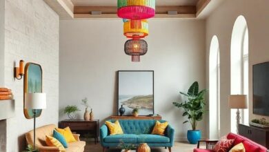
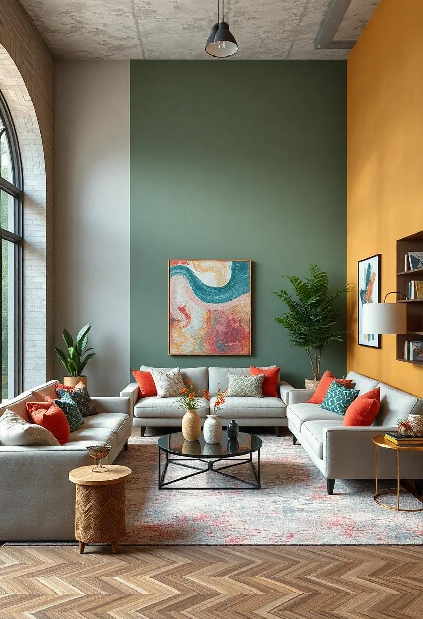
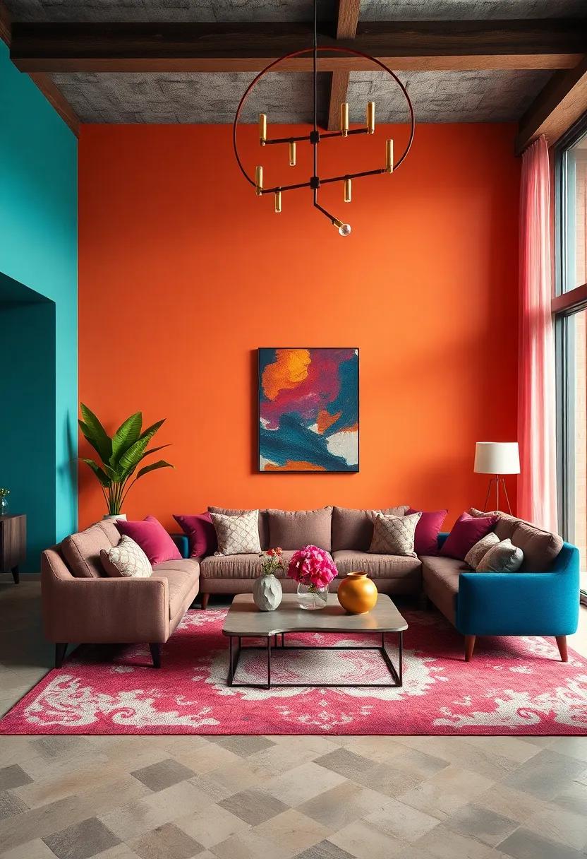
The Playful Mix of Jewel Tones and Soft Neutrals in an Eclectic Living Room Glow
Combining jewel tones like emerald green, sapphire blue, and amethyst purple with soft neutrals creates a living room atmosphere that is both dynamic and soothing. The intense richness of jewel colors acts as the perfect counterbalance to muted beiges, gentle grays, and creamy whites, allowing each hue to shine without overwhelming the senses. This playful juxtaposition invites an eclectic charm, where plush velvet cushions and deep-hued rugs sit comfortably beside linen drapes and natural wood accents, crafting a space that feels curated yet welcoming.
To achieve this vibrant balance, consider layering textures alongside your color choices:
- Velvet throw pillows in jewel hues for tactile luxury
- Woven neutral rugs to ground the room with subtle earthiness
- Brushed metal or brass accents that enhance the warmth of both color palettes
- Light, sheer curtains to soften and diffuse natural light, amplifying the room’s glow
| Jewel Tone | Complementary Neutral | Suggested Accent |
|---|---|---|
| Emerald Green | Warm Beige | Brass Lamp |
| Sapphire Blue | Soft Gray | Silver Frame |
| Amethyst Purple | Creamy White | Velvet Curtains |
Contrasting Warm and Cool Hues Blending Seamlessly Across Bold Eclectic Patterns
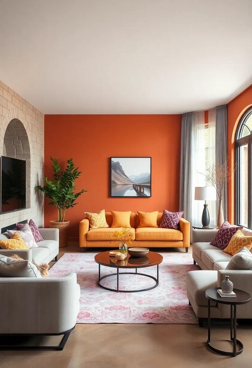
When designing a living room that bursts with personality, the dance between warm and cool hues becomes the ultimate tool to breathe life and balance into your space. Imagine a rich terracotta sofa paired with cushions in frosty teal and navy-this interplay creates a visual rhythm that captivates without overwhelming. By carefully blending these temperatures, you introduce layers of depth where fiery oranges mellow beside serene blues, and sunny yellows soften in the company of leafy greens. The key is to let each color retain its distinctiveness while allowing them to echo each other across the room’s fabrics and art.
To master this alchemy, experiment with bold patterns that invite both contrast and cohesion. Think of a striking geometric rug under a floral tapestry or a zigzag throw draped across a striped chair. These juxtapositions forge an eclectic narrative, making every corner pop with unexpected charm. Here’s a simple palette guide to keep the harmony flowing:
- Warm Accent Hues: Burnt orange, golden yellow, warm red
- Cool Accent Hues: Teal, indigo, emerald green
- Neutral Balancers: Cream, charcoal, soft taupe
| Pattern Type | Warm Hues | Cool Hues |
|---|---|---|
| Floral | Burnt sienna | Olive green |
| Geometric | Sunset red | Deep navy |
| Stripes | Goldenrod | Slate blue |
Layering Pastel Shades with Deep Saturated Colors for a Balanced Vibrant Space
When creating a lively and inviting living room, integrating pastel hues with deeper, saturated tones can transform your space into a masterpiece of balance and vibrancy. The secret lies in gentle layering: soft blush pinks, powder blues, or minty greens act as a serene canvas, while bold navy blues, rich emeralds, or fiery corals inject spirited energy. This combination energizes the room without overwhelming the senses, making it perfect for eclectic interiors that crave both calm and character.
To master this technique, consider the following layering tips:
- Anchor with deep tones: Use saturated colors on larger furniture pieces or accent walls to ground the design.
- Soft touches with pastels: Bring in pastel cushions, throws, or rugs to offer a subtle contrast and soften the intensity.
- Blend through textures: Mix velvets, linens, and matte finishes to add depth without adding complexity.
| Pastel Shade | Deep Saturated Complement | Ideal Use |
|---|---|---|
| Blush Pink | Emerald Green | Accent chairs & cushions |
| Powder Blue | Navy Blue | Rugs & feature wall |
| Mint Green | Burnt Orange | Throws & decorative vases |
Textures and Colors Intertwining to Create Dynamic Patterns in an Eclectic Living Room
In an eclectic living room, the fusion of textures and colors breathes life into every corner, transforming plain spaces into captivating visual tapestries. Imagine the tactile softness of velvet cushions brushed against the coarse grain of jute rugs, while walls painted in deep navy hues amplify the vibrant energy of mustard yellows and burnt oranges scattered throughout the room. This interplay is not accidental; it’s a deliberate dance where rough meets smooth, and cool complements warm, crafting an environment that feels both inviting and visually dynamic.
The secret to these successful combinations lies in intentional layering and contrast. A shaggy faux fur throw tossed over a sleek leather armchair adds unexpected depth, while patterned ceramics painted with bursts of cobalt blue rest alongside rustic wooden trays, inviting the eye to wander. Incorporate elements such as:
- Metallic accents for subtle shimmer
- Textured wallpapers with geometric or floral motifs
- Multicolored woven baskets to enhance dimensionality
Each element contributes not just color or texture, but a story that merges seamlessly into a dynamic, ever-evolving pattern unique to your living space.
| Texture | Color Palette | Effect |
|---|---|---|
| Velvet | Deep Teal, Mustard | Warmth and richness |
| Jute | Neutral Beige, Ivory | Organic grounding |
| Leather | Burnt Sienna | Bold contrast |
| Ceramics | Cobalt Blue, White | Pop of vibrancy |
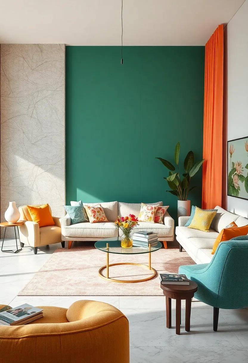
Sunlit Corners Highlighted by Bright Oranges and Muted Greens for a Harmonious Vibe
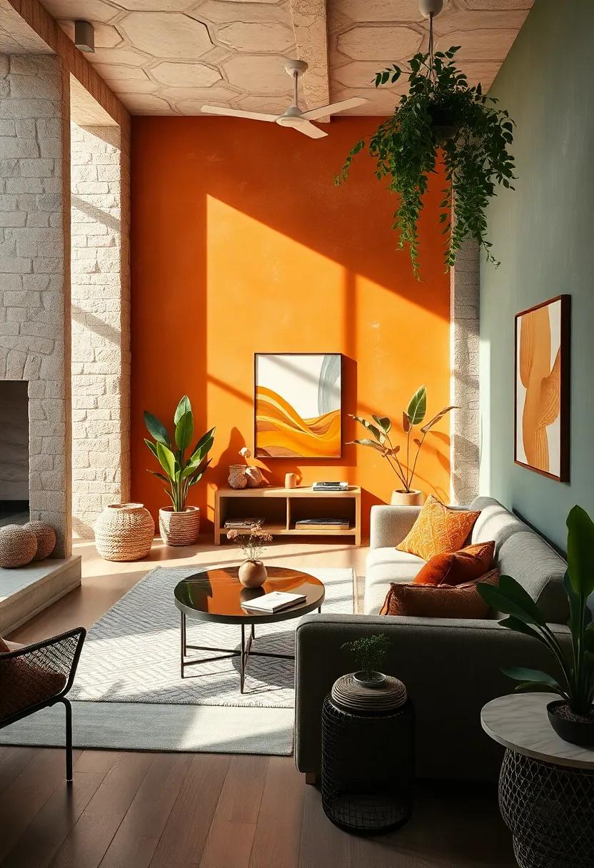
To bring a fresh yet cozy atmosphere to your living room, consider embracing the delicate dance between bright oranges and muted greens. These hues naturally catch sunlight, transforming corners of your space into inviting nooks that feel alive yet grounded. Bright oranges evoke warmth and energy, while the subtlety of muted greens introduces calm without overpowering. Together, they craft an eclectic palette that makes every sunlit corner a little sanctuary of harmonious contrast.
When designing with this color duo, balance is everything. Incorporate soft textures like linen cushions or woven rugs in muted greens to soften the vibrancy of orange accent pieces such as vases, throw blankets, or art prints. Here’s a quick guide to layering these colors effortlessly:
- Wall accents: Soft sage-green walls with a pop of tangerine in art or shelves
- Furniture: Neutral-toned sofas paired with burnt orange cushions
- Natural elements: Potted plants to echo muted green tones, enhancing freshness
- Lighting: Warm, golden bulbs that amplify the brightness of oranges
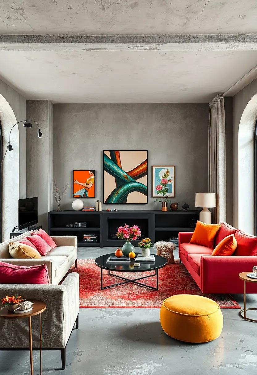
Eclectic Color Pairings Inspired by Vintage Art and Modern Abstract Designs
Embracing bold yet harmonious color combinations is key to transforming your living room into a vivid artwork that echoes both nostalgia and innovation. Draw inspiration from vintage art palettes featuring rich ochres, deep teals, and muted coral hues. These classic colors lend a warmth and timeless elegance that perfectly contrast with the unexpected pops of neon lime, electric blue, or fiery magenta drawn from modern abstract designs. The resulting interplay creates an invigorating atmosphere that’s both familiar and refreshingly avant-garde, inviting you to experience comfort with a twist of creative flair.
To master this eclectic blend effectively, consider combining colors using these strategic pairings:
- Mustard Yellow + Dusty Rose + Slate Gray – A vintage-inspired trio softened with modern neutrality
- Emerald Green + Tangerine + Pale Lavender – A lively mix balancing jewel tones with pastel accents
- Burnt Sienna + Teal + Neon Pink – A dynamic palette that merges earthy warmth with bold, contemporary energy
| Color | Mood | Use in Living Room |
|---|---|---|
| Ochre | Cozy, grounding | Accent wall or vintage upholstery |
| Electric Blue | Energizing, modern | Throw pillows or art pieces |
| Muted Coral | Soft, nostalgic | Area rugs or curtains |
| Neon Lime | Playful, vibrant | Accessories or statement lamps |
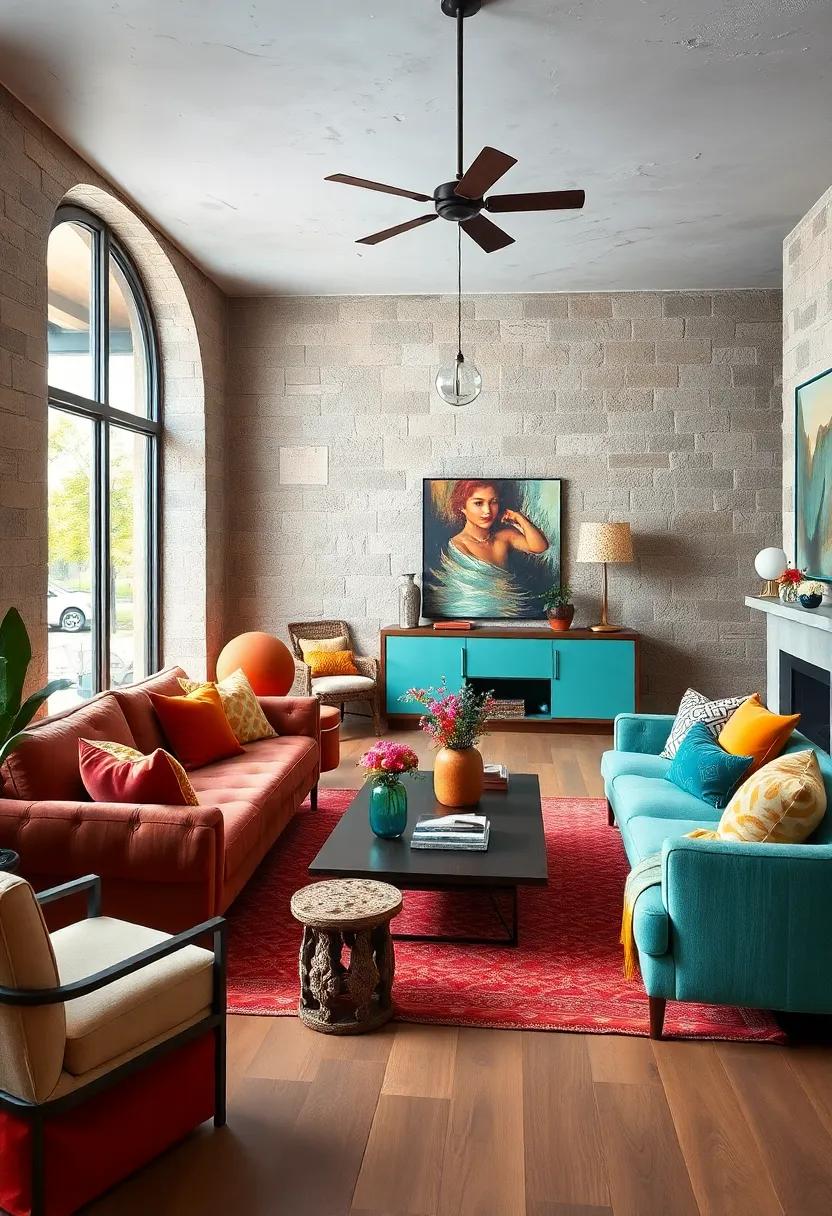
Rich Browns and Electric Blues Merging Under Warm Ambient Lighting for Inviting Comfort
Imagine a living room where rich browns, reminiscent of ancient mahogany and toasted caramel, peacefully coexist with electric blues – vivid, striking, and vibrant. This uncommon union creates a canvas that is both dynamic and inviting. Accentuated under warm ambient lighting, these colors soften and fuse, bathing the space in a comforting glow that encourages relaxation yet energizes the senses. Incorporating plush textiles like velvet cushions or leather armchairs in brown tones paired with cobalt or sapphire blue rugs or curtains creates a layered depth, inviting guests to stay longer and make the space their own.
The key to mastering this palette lies in thoughtful balance and textural play. Consider elements like:
- Natural wooden furniture that anchors the vibrancy with organic warmth
- Blue accent walls or art pieces to spark visual intrigue without overwhelming
- Soft, diffused lighting via amber bulbs or lamps with golden shades that highlight the warmth of browns and temper the intensity of blues
To visualize this harmony, here’s a simple breakdown of lighting effects on color perception:
| Light Source | Effect on Browns | Effect on Blues |
|---|---|---|
| Amber/Tungsten | Warms and deepens, enhances coziness | Softens intensity, mellows sharp edges |
| Cool White LED | Appears muted, may feel less inviting | Brightens and sharpens, energizes space |
By weaving together these elements, you create a living room environment that feels eclectic yet harmonious, where contrasts coexist beautifully under the glow of inviting warmth.
The Intricate Dance of Metallic Accents with Bold Color Blocks in Vibrant Harmony
When combining metallic accents with bold color blocks, the result is nothing short of transformative. Gold, brass, and copper elements catch light and add a shimmering contrast to saturated hues like emerald green, royal blue, or vibrant coral. These gleaming finishes act as visual anchors that ground an intense color palette, preventing it from feeling overwhelming. Consider integrating metallic light fixtures, side tables, or decorative trays alongside upholstered furniture or statement walls in daring colors. The interplay between reflective surfaces and solid color masses creates depth and movement that effortlessly enlivens a living space.
This balance can be further explored through texture and scale. For instance, pairing a bold, matte velvet sofa with sleek, polished-metal legs highlights the tension between softness and structure. Meanwhile, smaller metallic accessories like picture frames or vases placed on boldly hued shelves or console tables continue the story without competing. Here’s a quick guide to harmonizing these elements:
- Scale Contrast: Large color blocks with small metallic accents for subtle shimmer.
- Textural Balance: Matte finishes meet smooth, reflective metals.
- Color Coordination: Warm metals with warm tones, cool metals with jewel tones.
| Element | Effect | Example |
|---|---|---|
| Brass Lamp | Warm, inviting glow | Against a navy blue wall |
| Gold Frames | Elegant highlights | On a coral feature wall |
| Copper Side Table | Rustic modern charm | Beside a teal velvet sofa |
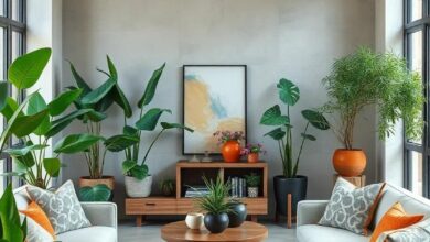
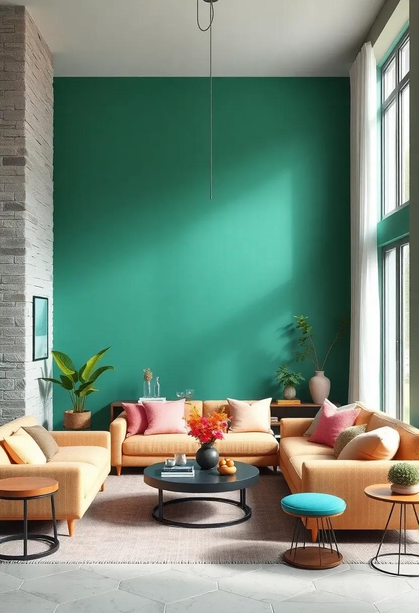
Lush Botanical Greens with Pops of Magenta and Tangerine in a Color Symphony
Immerse your living room in a vibrant jungle of botanical greens that bring both tranquility and life to your space. Shades of deep emerald and fresh moss serve as the perfect canvas, evoking the calming presence of nature indoors. To create dynamic contrast and a lively atmosphere, sprinkle accents of magenta and tangerine throughout your décor. These pops of color act like unexpected bursts of sunlight breaking through dense foliage, drawing the eye and energizing the room without overwhelming the senses.
Consider complementing your palette with natural textures and eclectic touches that meld harmoniously with this vivid color story. Velvet cushions, woven baskets, and glazed ceramics in contrasting shapes and finishes bring depth and intrigue. Below is a quick guide to pairing these colors effectively:
| Element | Botanical Greens | Magenta | Tangerine |
|---|---|---|---|
| Accent Furniture | Olive armchair | Magenta ottoman | Tangerine side table |
| Textiles | Moss green curtains | Magenta throw pillows | Tangerine rug highlights |
| Decor | Leaf-patterned pottery | Floral vases | Citrus-inspired art pieces |
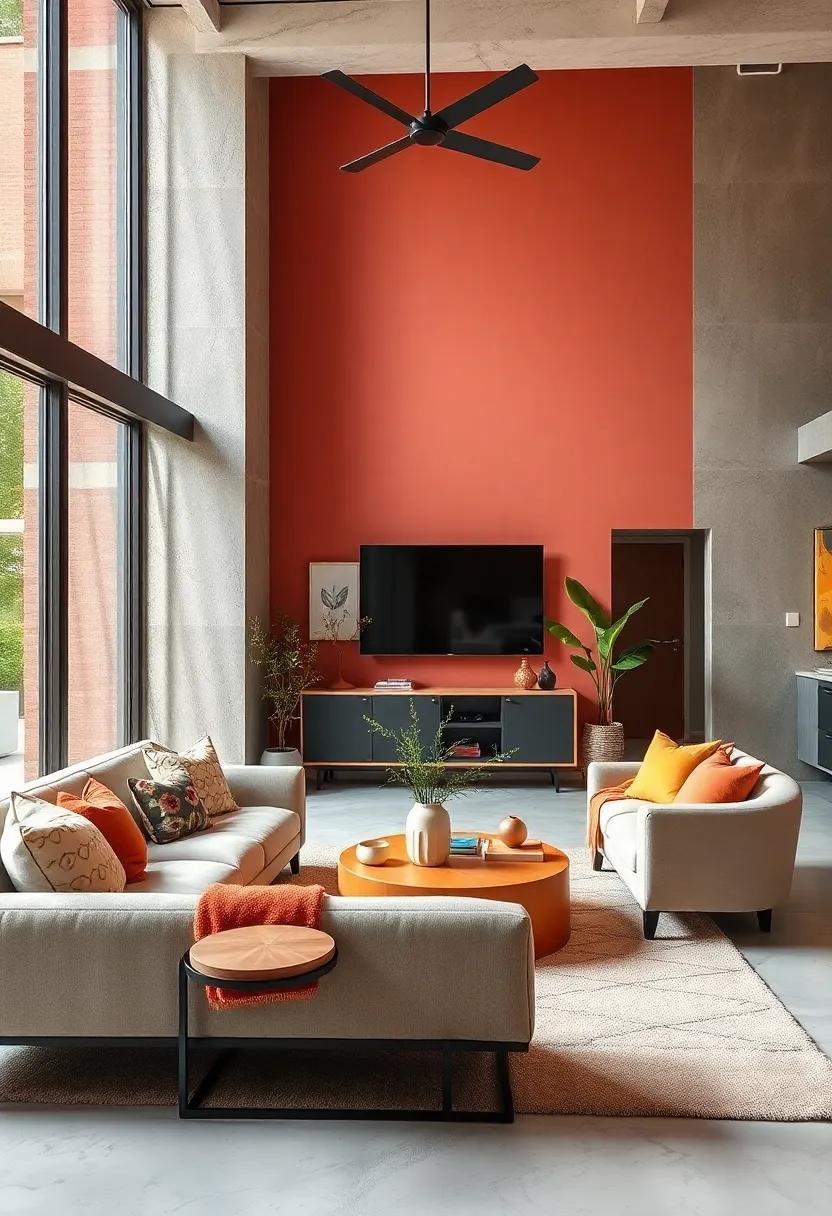
Juxtaposing Earthy Rust and Crisp Aqua in a Contemporary Eclectic Living Area
Integrating earthy rust tones with crisp aqua creates a dynamic dialogue within your living space, blending warmth with refreshing coolness. The bold, grounding presence of rust offers a welcoming embrace, while splashes of aqua introduce an airy vibrancy that lifts the overall ambiance. This balance is especially effective when layered with varied textures such as linen cushions, subtle velvet throws, or matte ceramic vases. Strategically placed aqua accents-as in artwork, patterned rugs, or decorative glassware-can punctuate the richness of rust, allowing both hues to coexist without competing.
To maintain cohesion in this eclectic mix, consider incorporating natural elements and metals that resonate with both colors. A wooden coffee table or woven basket adds organic depth, while brushed brass or copper fixtures echo rust’s warmth and complement aqua’s clarity. The trick lies in thoughtful distribution-avoid overwhelming the space with either color by employing a color zoning approach. For example:
| Area | Primary Color | Accent Color |
|---|---|---|
| Seating | Rust Upholstery | Aqua Cushions |
| Walls | Soft Neutral | Aqua Artwork |
| Accessories | Rust Pottery | Aqua Vases |
- Layer textures: mix rustic fabrics with smooth silks or glossy ceramics.
- Play with patterns: introduce subtle geometrics that blend both colors.
- Balance with neutrals: creamy whites or sandy beiges allow the palette to breathe.
Delicate Florals and Stripes Collide in a Palette of Bold Primary and Secondary Colors
When delicate florals meet the structured rhythm of stripes, the result is a playful yet sophisticated dance of patterns that breathe life into your living space. Embracing a palette that mixes bold primary hues-such as vibrant reds, blues, and yellows-with their secondary counterparts introduces a dynamic tension that captivates the eye. This interplay creates an environment where softness and structure coexist, showcasing the timeless elegance of florals softened by the crispness of stripes. The key is to balance these contrasting elements through scale and color saturation; use large, sweeping floral prints to complement narrow, defined stripes, and alternate between solid and patterned textures to maintain harmony.
To successfully harness this eclectic pairing, consider the following principles:
- Anchor your space with a dominant color from your palette, then integrate accents in contrast shades.
- Mix pattern scales wisely – pair oversized florals with thin, delicate stripes to avoid visual clutter.
- Use neutrals strategically as buffers within the palette to give the eyes a place to rest.
Below is a concise guide illustrating harmonious color combinations that celebrate this vibrant fusion:
| Primary Hues | Complementary Secondary Shades | Pattern Pairing Tip |
|---|---|---|
| Bright Red | Vivid Orange | Large florals with thin, vertical stripes |
| Royal Blue | Lively Green | Dense floral patterns paired with wide horizontal stripes |
| Sunny Yellow | Bold Purple | Small florals mixed with alternating thick and thin stripes |
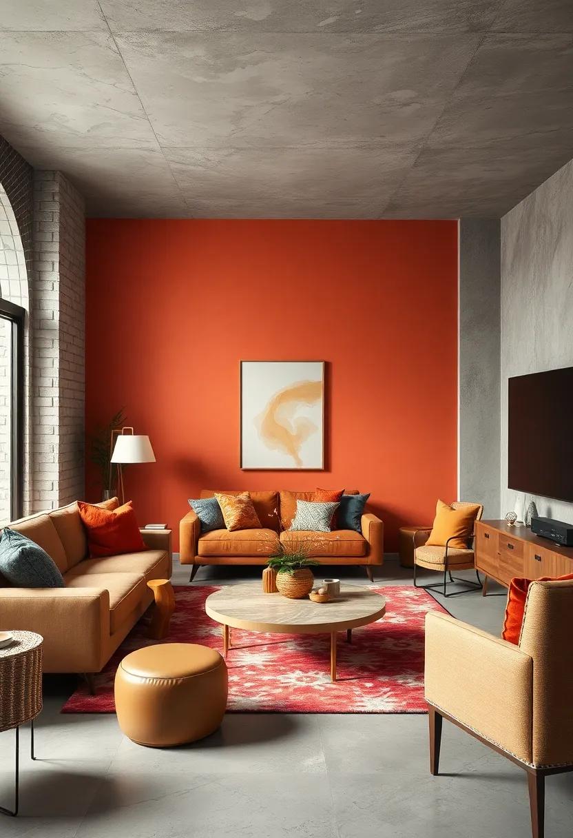
Mixing Warm Terracotta with Cool Lavender Shades to Create Visual Depth and Interest
Integrating the warmth of terracotta with the cool tranquility of lavender introduces a captivating dynamic that transforms any living room into a sanctuary of style. This pairing plays beautifully on the natural contrasts of temperature and emotion-terracotta’s fiery, clay-rich tones evoke a grounded, earthy comfort, while lavender offers a soft, breezy coolness that relieves and refreshes. To maximize depth, consider layering these colors through varied textures and finishes: plush velvet lavender cushions against a matte terracotta sofa, or a smooth lavender-painted wall backdrop accented with rugged terracotta ceramics. The interplay invites the eye to explore every corner, enriching the space with subtle tension and harmony.
- Balance intensity : Use terracotta as bold accents, such as in artwork or rugs, while lavender spans larger surfaces like walls or curtains for a calming effect.
- Play with patterns : Introduce geometric or floral designs that weave both colors to unify the scheme without overwhelming the senses.
- Add natural elements : Incorporate greenery and wooden tones to bridge the warm and cool, enhancing the organic feel inherent to this palette.
| Element | Warm Terracotta | Cool Lavender | Visual Effect |
|---|---|---|---|
| Textiles | Rough linen cushions | Silky throw blankets | Textural diversity |
| Wall Treatments | Matte finish | Soft satin sheen | Light reflection contrast |
| Accent Pieces | Terracotta pots | Lavender glass vases | Shape and material play |
Electric Neons Subtly Balanced by Muted Greys and Creams in an Urban Eclectic Room
Incorporating electric neon accents into an urban eclectic room can instantly energize the space, creating vibrant focal points without overwhelming the senses. When paired with muted greys and creams, these bold hues find balance, allowing each element to breathe and shine. Think neon cushions or playful wall art that pop against serene neutral walls, while soft cream rugs and grey upholstered furniture ground the room with subtle warmth. This intelligent juxtaposition brings a fresh, dynamic quality to your living area, blending contemporary flair with cozy sophistication.
To master this balance, consider the following design elements:
- Accent Pieces: Neon lamps, throw pillows, or abstract sculptures that inject vibrant energy
- Base Layers: Cream-toned rugs, curtains, and soft furnishings to soften the atmosphere
- Structural Colors: Shades of grey on walls or larger furniture to provide a neutral foundation
| Design Element | Color Role | Example |
|---|---|---|
| Wall Art | Neon Pop | Electric pink geometric print |
| Sofa | Muted Base | Soft dove grey fabric |
| Flooring | Neutral Warmth | Cream shaggy rug |
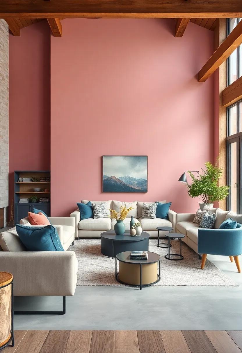
The Impact of Deep Burgundy Accents Amid Soft, Muted Pastel Backdrops
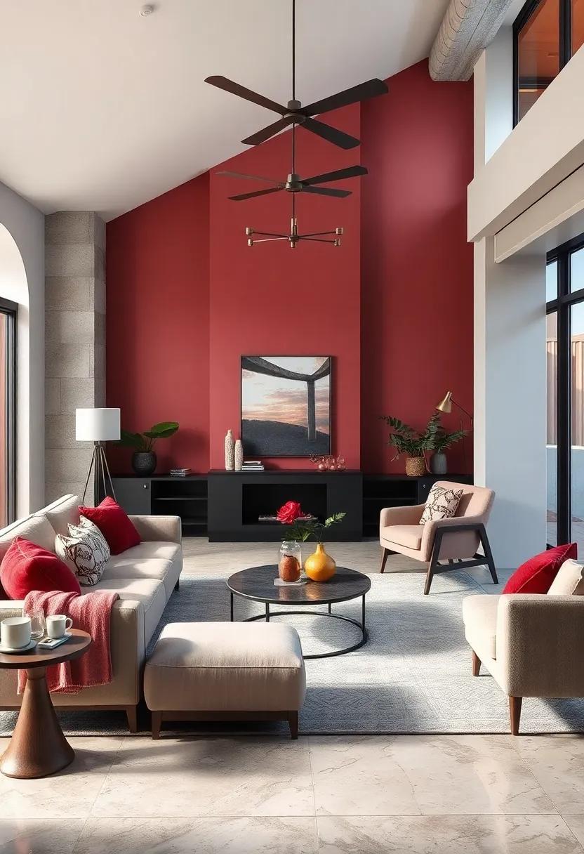
Deep burgundy serves as a powerful counterpoint to the ethereal softness of muted pastels, creating a dynamic yet balanced visual experience. When strategically placed, these rich accents inject warmth and depth without overpowering the subtle serenity of pale pinks, blues, or greens. The contrast beckons the eye, becoming focal points that anchor the room’s aesthetic and invite intrigue. Whether introduced through plush velvet cushions, sleek vases, or bold artwork frames, burgundy elements offer a sense of refined drama, effortlessly elevating the entire space.
The interplay between these colors thrives on contrast and harmony alike. A carefully curated mix can cultivate an atmosphere that feels both inviting and sophisticated. Consider layering textures-soft pastels in linen upholstery paired with burgundy silk throws or matte ceramic accessories-to enhance the sensory dimension. Below is a quick guide to using deep burgundy accents with pastel tones:
- Balance intensity: Limit burgundy to 10-15% of the room’s palette.
- Contrast textures: Pair burgundy’s richness with airy, delicate fabrics.
- Repeat accents: Use burgundy in multiple spots to create visual continuity.
- Anchor furniture: Integrate burgundy in armchairs or side tables for lasting impact.
| Element | Pastel Pairing | Burgundy Accent |
|---|---|---|
| Wall Color | Soft Mint Green | Deep Burgundy Frame |
| Upholstery | Pale Blush Pink | Burgundy Throw Pillows |
| Decor | Light Lavender | Burgundy Ceramic Vase |
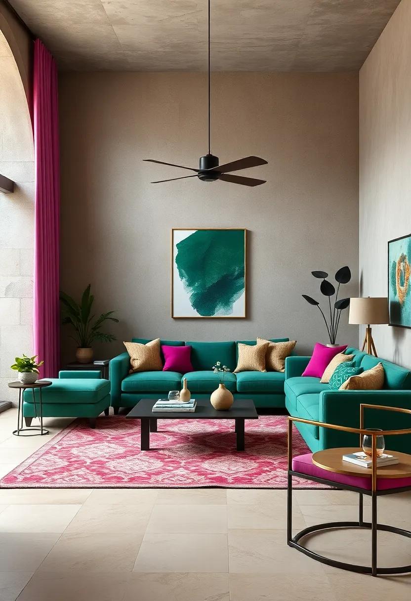
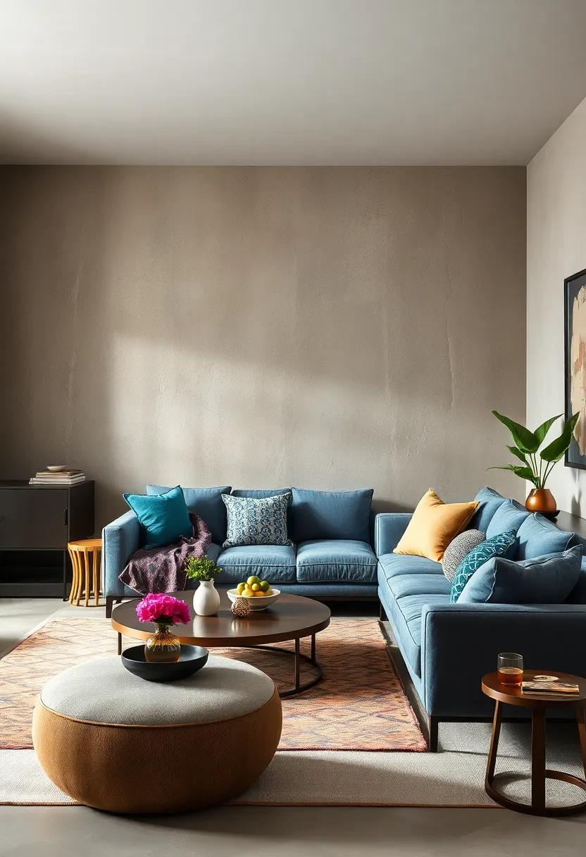
Warm Mustard Yellow and Ocean Teal Creating Serenity and Energy in Equal Measure
Blending warm mustard yellow with the cool, tranquil hues of ocean teal strikes a perfect balance that invigorates yet calms your living room atmosphere. The golden undertones of mustard yellow bring a sunlit warmth, sparking creativity and optimism, while ocean teal anchors the space with its serene depth, evoking the peaceful rhythm of gentle waves. This dynamic duo can be thoughtfully layered through accent walls, plush cushions, or elegant rugs to invite both energy and relaxation into your daily environment.
To harmonize these potent colors without overwhelming the senses, consider pairing them with neutral elements like soft grays or crisp whites. The careful interplay of textures also enhances the eclectic vibe – think of a woven mustard throw contrasted against smooth teal ceramics or glossy glass accessories. The following table illustrates potential pairings and their effects on mood, helping you tailor this vibrant harmony to your unique style:
| Element | Material | Effect |
|---|---|---|
| Throw Pillow | Velvet in Mustard Yellow | Warmth & Luxury |
| Vase | Matte Ocean Teal Ceramic | Calm & Depth |
| Accent Rug | Woven Wool Blend | Textured Coziness |
| Lamp Shade | White Linen | Subtle Contrast |
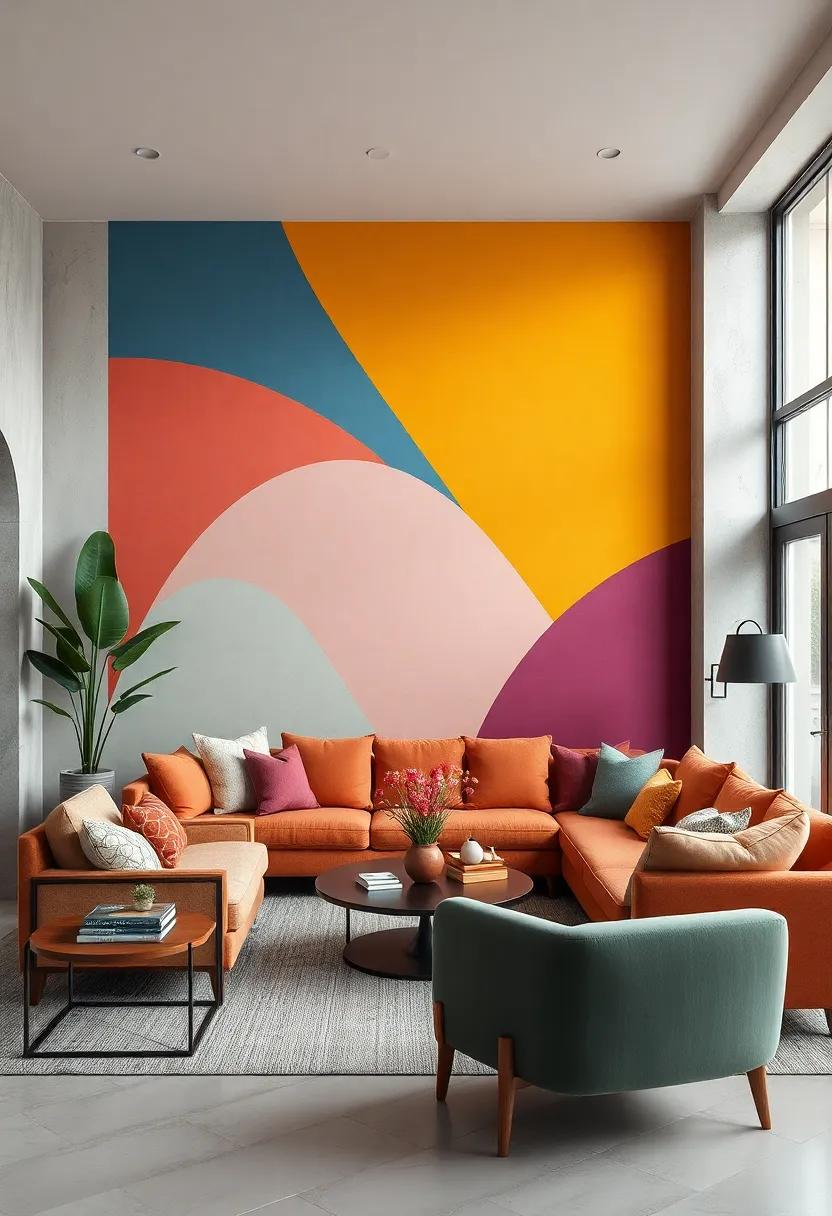
Abstract Color Blocks with Soft Curves and Sharp Angles in Eclectic Living Room Art
Incorporating abstract color blocks with soft curves and sharp angles into your living room art creates a mesmerizing interplay that breathes life into eclectic spaces. The contrast between fluid shapes and geometric edges introduces dynamic movement and balance, inviting the eye to dance across the canvas. This artistic approach allows for bold experimentation with hues, blending vibrant tones with muted shades to craft a harmonious visual narrative that complements a variety of furniture styles and textures.
To successfully integrate these striking artworks, consider the following design principles:
- Balance vivid colors with neutral backgrounds to avoid overwhelming the space.
- Mix materials by pairing lacquered frames with textured wall finishes for tactile contrast.
- Size matters: large-scale pieces emphasize the angular and curved interplay, making a powerful statement.
- Layering artwork at different heights enhances depth and interest in your gallery wall.
| Element | Effect | Design Tip |
|---|---|---|
| Soft Curves | Creates fluidity | Use pastels or watercolor washes |
| Sharp Angles | Adds structure | Employ bold, contrasting colors |
| Color Blocks | Defines space | Alternate warm and cool palettes |
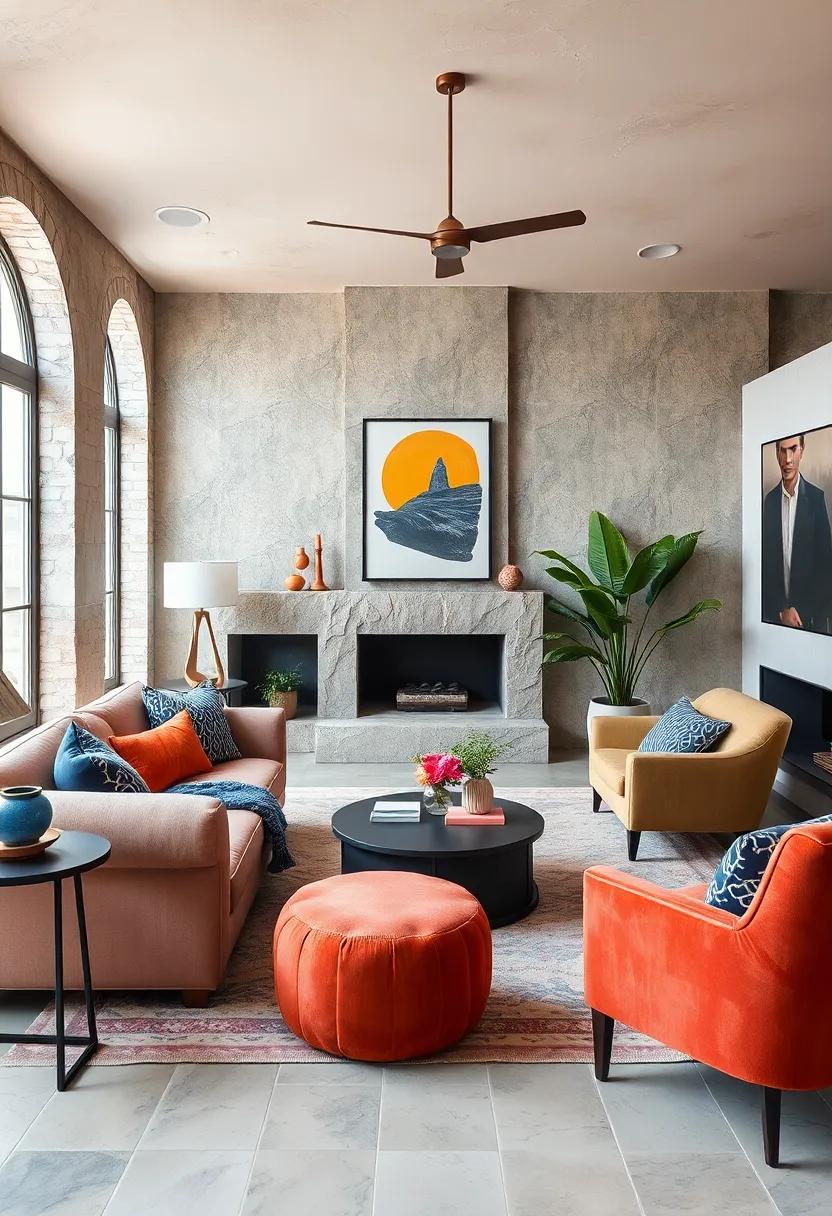
Bold Fuchsia and Emerald Greens Blended with Neutral Browns for Earthy Elegance
Infusing your living room with bursts of bold fuchsia and emerald greens creates a striking centerpiece for any eclectic design. These vibrant hues call for a thoughtful counterbalance, and that’s where neutral browns come into play, grounding the space with warmth and subtle sophistication. Imagine plush velvet cushions in deep fuchsia resting against a backdrop of soft leather sofas in rich chestnut tones, complemented by vibrant emerald plants that breathe life into the room. This mix not only invigorates your environment but also invites a tactile experience, where texture meets color in perfect harmony.
To elevate this ensemble seamlessly, consider layering with the following elements:
- Wooden accents: Teak or walnut side tables amplify the earthy vibe while adding functional artistry.
- Metallic details: Bronze or copper fixtures offer subtle highlights that catch the light without detracting from the bold palette.
- Natural fibers: Jute or sisal rugs help to ground the space and add organic texture.
| Color | Material | Purpose |
|---|---|---|
| Fuchsia | Velvet throw pillows | Accent pop |
| Emerald Green | Live houseplants | Natural freshness |
| Neutral Brown | Leather sofa | Grounding warmth |
Peach Softness and Cobalt Intensity in a Layered Color Story With Textured Elements
The delicate warmth of peach introduces an inviting softness that balances the boldness of cobalt, creating a visually appealing contrast in your living space. Layering these hues thoughtfully, perhaps through plush cushions, draped throws, or accent walls, transforms the palette into a tactile journey. Incorporating textured elements such as woven baskets, vintage ceramics, or a distressed rug can amplify this dynamic interplay, adding depth that invites both the eyes and fingertips to explore. The subtle glow of peach tones soothes while cobalt’s vivid energy commands attention-together crafting a nuanced narrative that feels both lively and serene.
To achieve harmony within this eclectic color story, consider a blend of finishes and materials that elevate the layered effect without overpowering the senses. Matte and glossy surfaces paired with varied fiber types create an intricate dance of light and texture. Below is a quick guide for balancing these tones and textures effectively:
| Element | Material | Color Focus | Texture |
|---|---|---|---|
| Cushions | Linen | Peach | Soft, breathable |
| Rug | Wool blend | Cobalt | Coarse, patterned |
| Decorative Vase | Ceramic | Cobalt | Glossy finish |
| Throw Blanket | Chunky Knit | Peach | Thick, cozy |
- Mix textures: balance smooth ceramics with soft textiles.
- Play with scale: large cobalt accents with small peach details create a dynamic visual rhythm.
- Use lighting wisely: warm light enhances peach softness, while cooler light amplifies cobalt intensity.
Creamy Whites and Vivid Coral Tones Intertwined Around Quirky Vintage Furniture
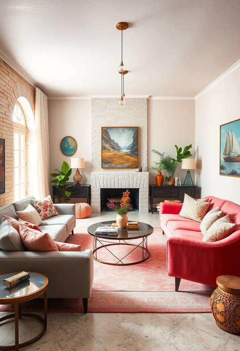
Balancing creamy whites with bursts of vivid coral breathes life into any living space, especially when paired with quirky vintage furniture. The subtle warmth of cream tones serves as a soft, inviting canvas that highlights the playful energy of coral accents. Think plush coral cushions resting on a classic, tufted armchair or coral-hued art pieces placed strategically around an off-white sideboard. This dance of muted and bright colors sparks visual interest while maintaining an elegant cohesion that feels both fresh and timeless.
To amplify the stylistic harmony, integrating vintage furniture with distinctive shapes and textures enhances the room’s personality. Consider pieces featuring:
- Curved wooden frames with intricate carvings
- Bold brass hardware adding a touch of shine
- Worn leather or velvet upholstery that invites comfort
Here’s a simple guide to mixing these elements with color:
| Furniture Style | Best Coral Element | Cream Pairing |
|---|---|---|
| Mid-century armchair | Coral throw blanket | Cream shag rug |
| Art Deco side table | Coral ceramic vase | Cream marble top |
| Rustic cabinet | Coral floral arrangement | Cream linen curtains |
By weaving these colors and textures thoughtfully, the living room evolves into a cozy sanctuary where vibrant expression meets curated vintage charm.
Subtle Gold Highlights Reflecting in a Palette of Moody Blues and Warm Taupe
Infusing your living space with a rich tapestry of deep blues and earthy taupes creates a captivating backdrop that invites calm and comfort. By weaving in subtle gold highlights, you introduce a touch of understated luxury that dances gently with natural and artificial light. This combination achieves a balance where bold meets soft, offering a palette that is both grounded and intriguingly dynamic. The warmth of taupe cushions the cooler, moody blues, while the gold accents add shimmer without overwhelming the serene atmosphere.
To master this look, consider these styling elements:
- Textural play: Incorporate velvet cushions, linen throws, and woven rugs to complement the color scheme with inviting tactility.
- Metallic accents: Opt for brushed gold lighting fixtures, frames, or delicate figurines to echo the gold highlights tastefully.
- Layered lighting: Use table lamps and wall sconces to allow the gold elements to reflect variably, adapting the mood throughout the day.
| Color | Finish | Best Use |
|---|---|---|
| Moody Blue | Matte | Accent walls, upholstery |
| Warm Taupe | Soft Satin | Furniture, drapes |
| Subtle Gold | Brushed Metallic | Lighting, decor pieces |
Dynamic Combinations of Bridesmaid Pink and Slate Blue Under Rustic Wooden Features
Marrying the soft warmth of bridesmaid pink with the cool, grounding nuances of slate blue creates a refreshing yet cozy atmosphere when paired with rustic wooden accents. The natural textures of aged wood emphasize the muted vibrancy of these colors, transforming any living space into a balanced retreat. By layering cushions, throws, and decor in varying shades within these hues, you invite a playful interplay of light and texture that breathes life into your room without overwhelming the senses.
To pull off this color fusion seamlessly, consider integrating elements such as:
- Distressed wood furniture to enhance the rustic charm
- Soft pastel textiles in blush and dusty rose
- Slate blue ceramics and vases for subtle accents
- Natural fiber rugs to ground the color palette
| Material | Color Role | Effect |
|---|---|---|
| Reclaimed Pine | Rustic Base | Warmth and texture |
| Linen Throws | Bridesmaid Pink | Softness and comfort |
| Slate Blue Pottery | Accent | Cool contrast |
By experimenting with this palette, you can craft a living room that is not only visually dynamic but also emotionally comforting-where contemporary elegance meets rustic simplicity in perfect harmony.
In Summary
In the end, crafting vibrant harmony within your living room is an invitation to celebrate both color and creativity. By thoughtfully blending eclectic hues and tones, you not only transform a space but also weave a story that is uniquely yours. Whether bold or understated, your color choices shape an atmosphere where every moment feels alive and authentically lived. Embrace the art of eclectic color schemes, and let your living room become a canvas of endless possibilities.